Scandinavian abstract art: what abstraction looks like in the North
Say abstract art and most people picture mid-century New York. The Nordic version's a different animal: flat colour, cut silhouettes and a motif you can still name. What Scandinavian abstraction actually looks like, and how the gallery's abstract prints read against it.
Helene Brox's Swallow Dive is filed under Abstract, and the first thing you notice is that it's full of birds. Dozens of them, deep cobalt wings diving over warm cream, packed edge to edge with no horizon and no resting point. Nothing about that is abstract in the way most people mean the word. The label's still right, though, because pack a flock that tightly and it stops reading as birds and starts reading as pattern.
That gap is worth a few hundred words: what abstraction means in a Nordic idiom, and what it means in most people's heads.
The abstraction most people picture
Say "abstract art" and the image that arrives is usually mid-century New York. Big canvases, poured paint and floating fields, Pollock and Rothko, and a deliberate break with the visible world. That version made abstraction famous, and it set the terms while it was at it: to be abstract is to have no subject.
The North never really signed up to that.
Nordic abstraction kept the subject
The region has a decent claim on the origin story. Hilma af Klint painted her first abstract picture in a Stockholm studio in 1906, five years before Kandinsky claimed the same first for himself, and by her death in 1944 she hadn't exhibited a single one of them (Tate tells it well). Even so, af Klint's abstractions are diagrams. She was trying to set down a reality she believed was genuinely there, not empty the picture out.
Norway's abstract painters, when they arrived, did much the same. Jakob Weidemann (1923 to 2001) pioneered abstract painting in Norway in the decades after the Second World War, and his mature work gets described as abstract expressionism with nature as its basis. His best-known pictures are the skogbunnbilder, the forest floor paintings, shown at Kunstnernes Hus in Oslo in 1961: abstract, and also unmistakably a long look at the ground in a Norwegian wood. His contemporary Gunnar S. Gundersen (1921 to 1983) pushed nearer to pure form, debuting in 1947 and quickly counted among the leaders of abstract art in Norway, building his pictures out of flat fields of colour.
Flat fields of colour. Hold onto that one.
The other half of the story was printed
Painting's only half of it. Nordic abstraction had its widest life on cloth and paper. Maija Isola (1927 to 2001) made around 500 patterns for Marimekko across forty years, simple, bold, flat patterns printed at a dramatic scale, and her Unikko poppy of 1964 is the one everybody can picture: a flower cut back to a few flat shapes and blown up until the size does half the work. Marimekko's Finnish rather than Scandinavian strictly, but the instinct is regional. Reduce the motif, flatten the colour, repeat it.
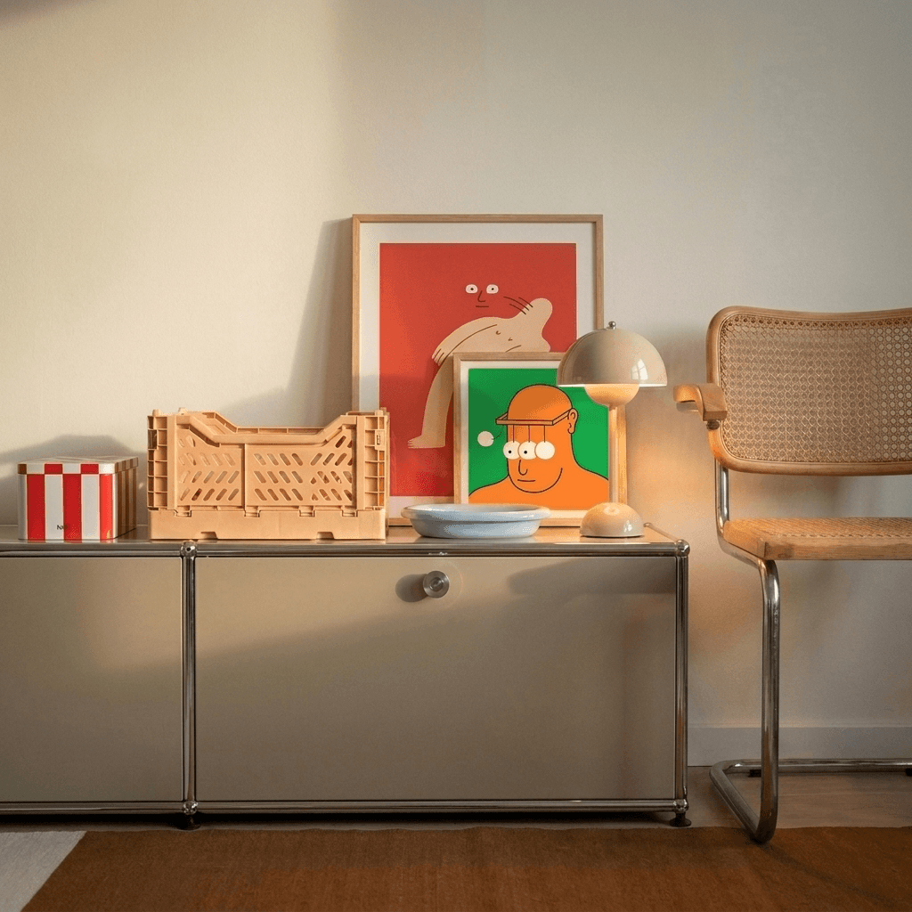
The other thing behind the look is the stencil. A screenprint starts by cutting a shape out of paper, laying it over the mesh and pulling ink across it, and a cut edge can't describe anything: no modelling, no brushwork, no visible hand. It gives you silhouette, and then everything rests on whether the silhouette reads. You can see the same logic in Brox's bold cut-out shapes: no modelling, no visible hand, just an edge that either carries the image or doesn't.
Put the two halves together and you've got the tension running through the whole tradition: folk pattern on one side, all repetition and ornament, modernist reduction on the other, stripping back until only the essential is left. Print is where the two meet. The folk end of that story, the rosemaling and the painted chests, sits in what is Scandinavian art if you want the longer history first.
So what does it actually look like
Four habits, if you want a shorthand.
- Flat colour rather than built-up paint. One ground, a figure or two on it, and the join between them left crisp.
- Shape carrying the whole picture. No modelling, no depth, no brushstroke to admire.
- A motif you can still name. A bird, a body, water, a flower. Abstracted, not abandoned.
- Restraint about how much. Two colours where four were available.
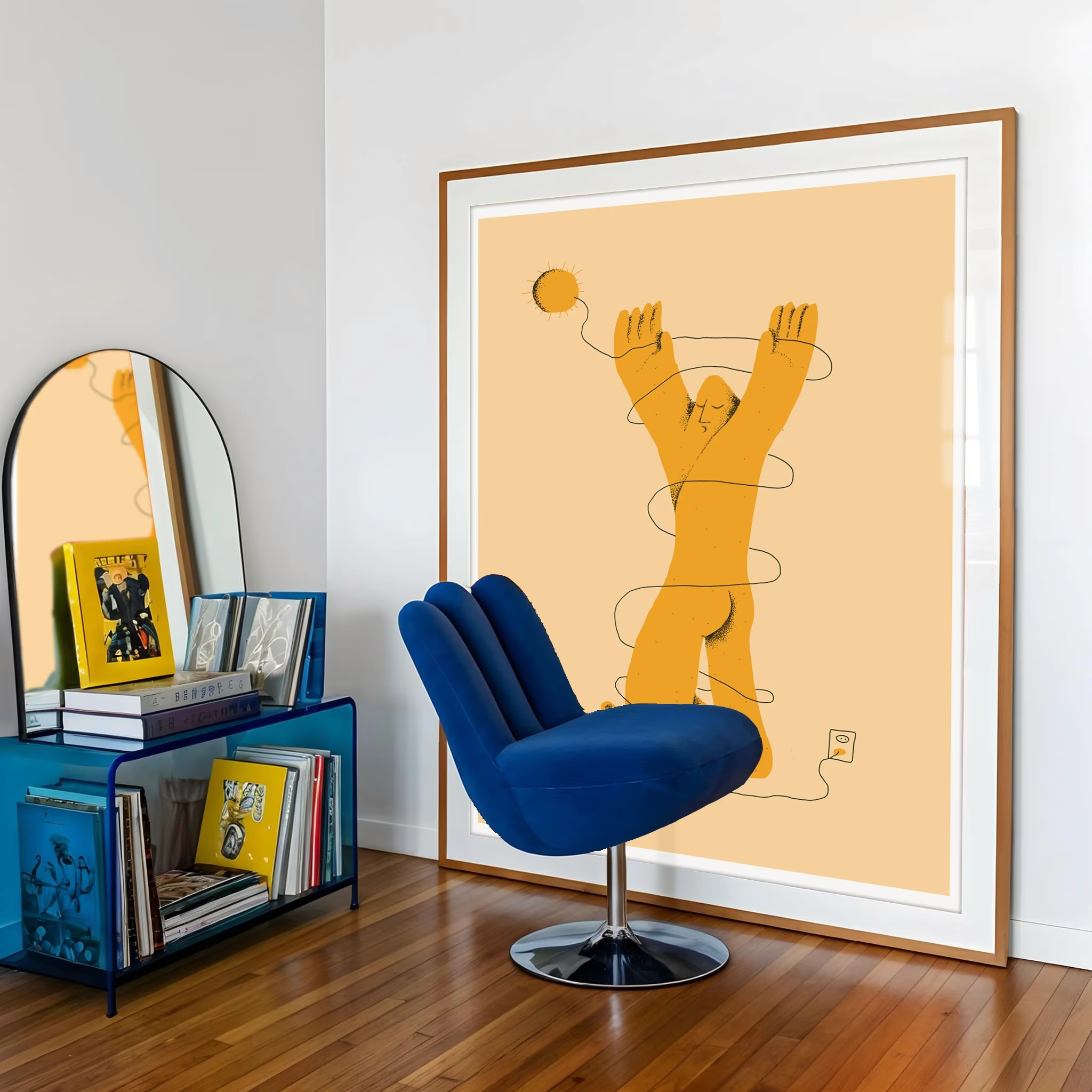
Which is why it hangs so easily in an ordinary room. This is abstraction that was always meant for a wall someone lives in front of, rather than a museum atrium.
How the gallery's own abstracts read against that
Eight of the twenty prints here are filed as abstract, the largest group in the gallery, and all eight fit the description.
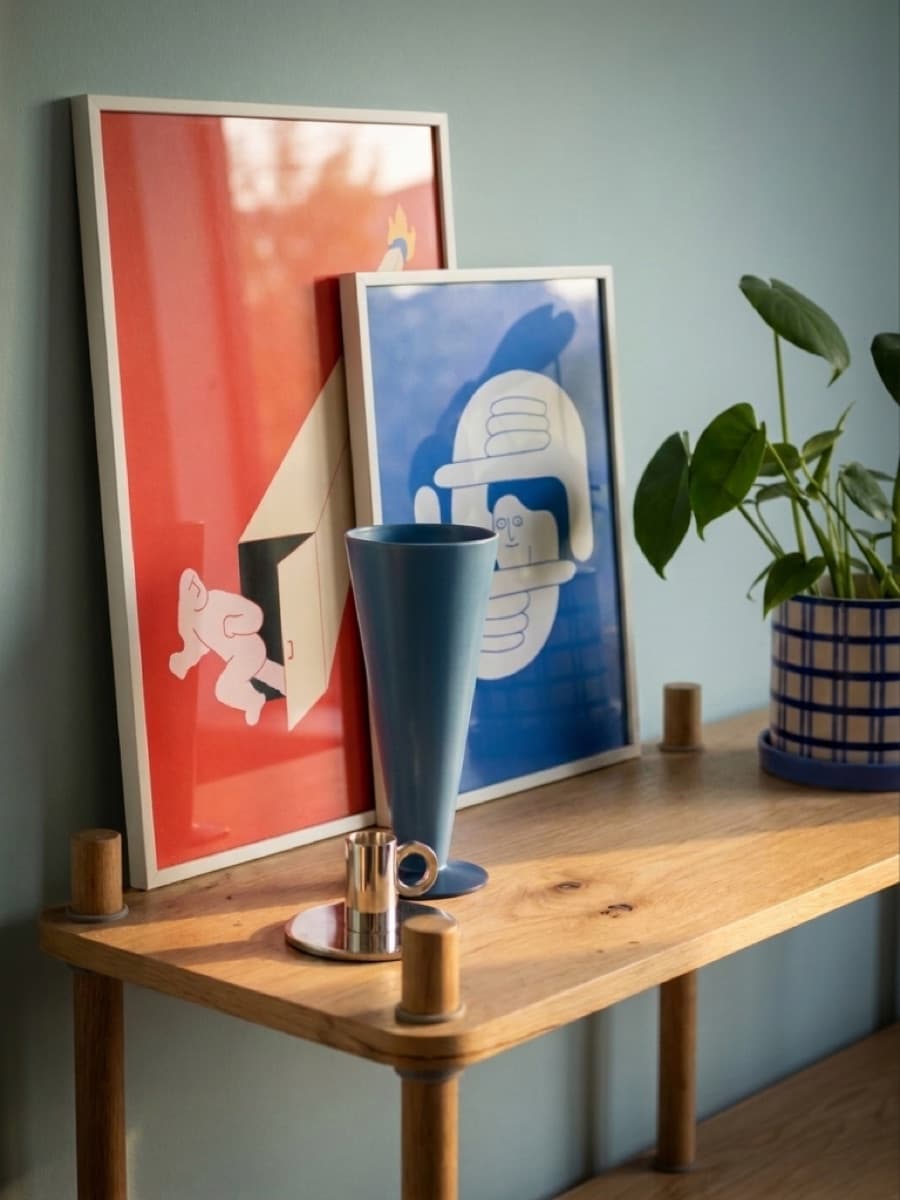
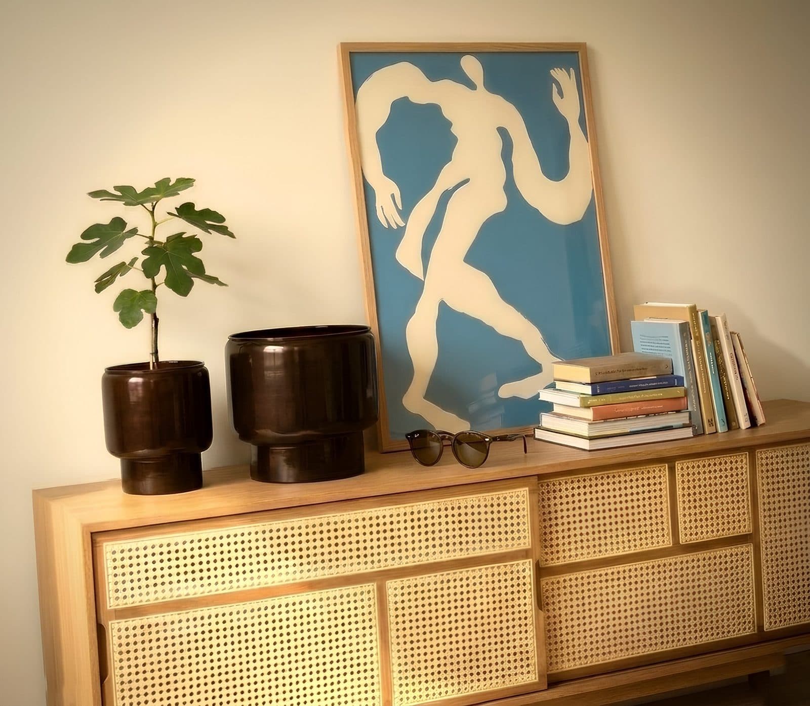
Helene Brox works in exactly this register, flat colour and cut silhouette, and her four abstracts show how much range that leaves. Swallow Dive is the calm end: two colours, cobalt on cream, all the movement carried by shape. Dancer catches a cream figure mid-stride on sky blue, no face and no floor, just the shape of movement itself. Dragon coils ribbons of white, red and pink across a black ground until two pale blue eyes snap it into focus. And IThinkIThink spells its confession, I think I think too much, in green brush strokes across a cobalt head on shocking pink. Same reduction, four different temperatures.
Helene Brox works the other way round, one shape on one field. Dancer is a cream figure mid-stride on sky blue, no face and no floor, the movement carried entirely by the outline. Swallow Dive is stricter still, one blue and one cream, diving birds edge to edge with no horizon to land on. Dragon is the loud one, ribbons of white, red, pink and grey on black that only assemble into a beast once you find the pale blue eyes. And IThinkIThink puts its confession in green brush strokes across a cobalt head on shocking pink, which is roughly where abstraction and cartoon shake hands.
If the word's been putting you off
It puts plenty of people off, and fairly: abstract art has a reputation for asking you to work. Nothing here does. Every one of these prints is a recognisable thing, simplified until the shape does the talking, which is a much older northern habit than the word suggests.
Practically, they suit a room that's already close to calm: one confident piece on a pale wall, or a pair from the same hand hung to read as a single gesture. How to style Scandinavian wall art in a living room covers placement, and Scandinavian wall decor ideas has the wider options. When you'd rather look than read, the abstract prints are all in one place, and the full wall art collection sets them next to everything else.