How to choose wall art for a Scandinavian interior
Style, size, combinations and colour: the four questions behind choosing wall art for a Scandinavian interior, answered plainly.
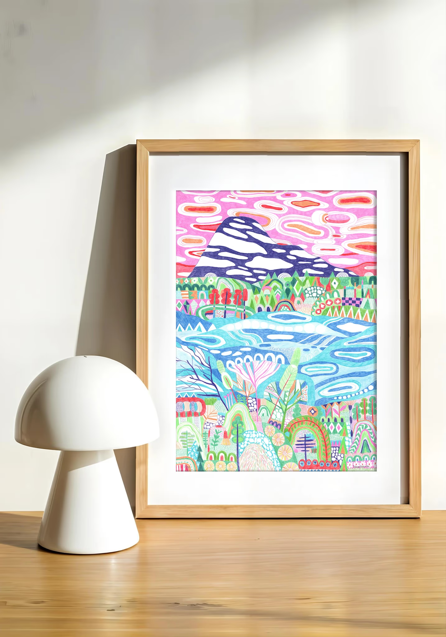
The room's done. White walls, pale floor, the sofa you saved for. Then the wall behind it asks the only question left, and it turns out to be four questions wearing one coat. Here they are, answered in order.
Which style of art suits a Scandinavian interior?
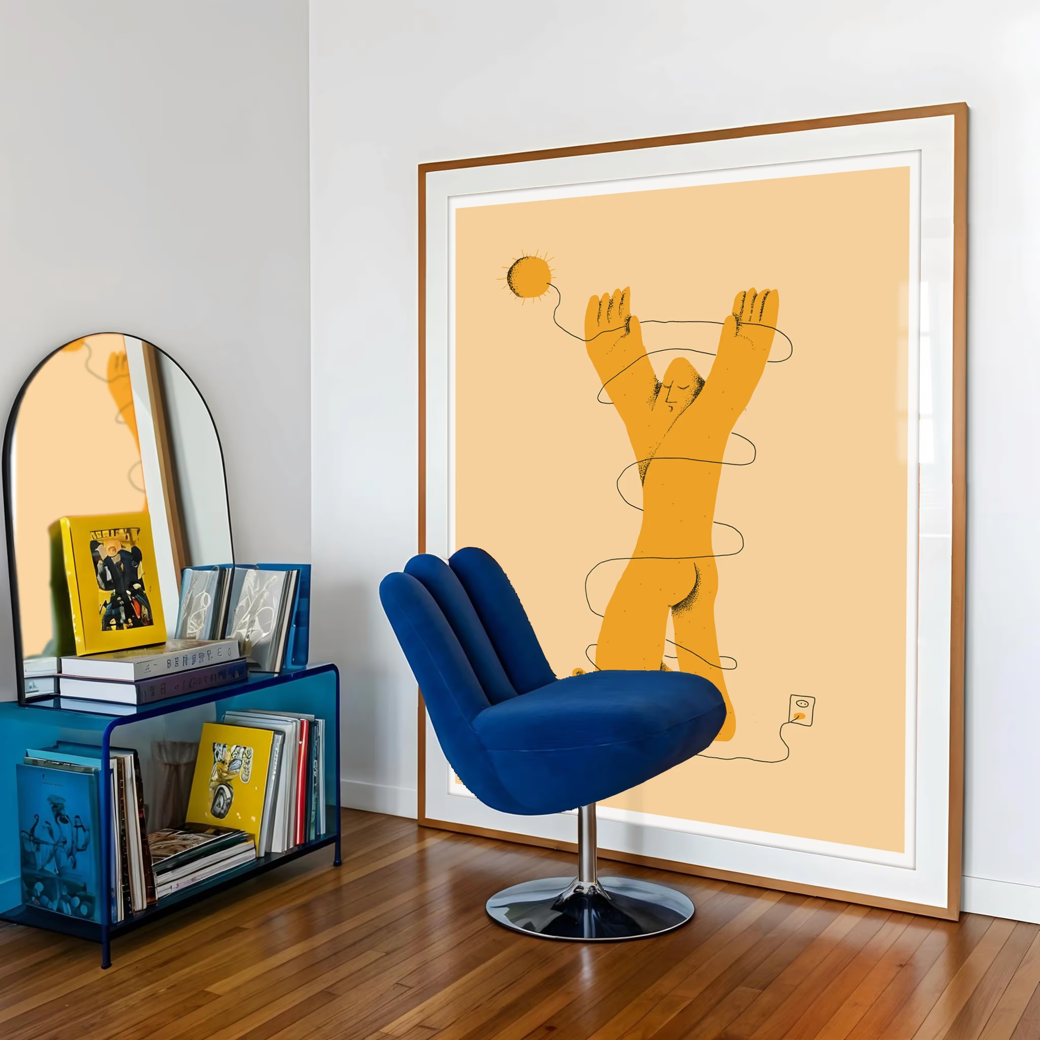
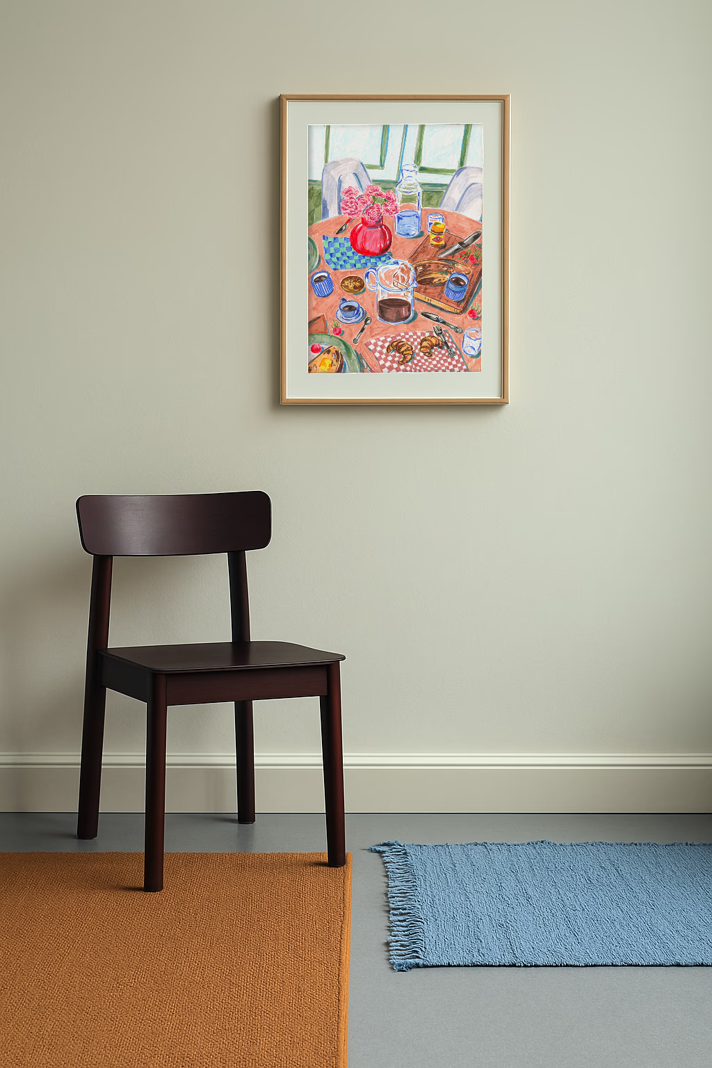
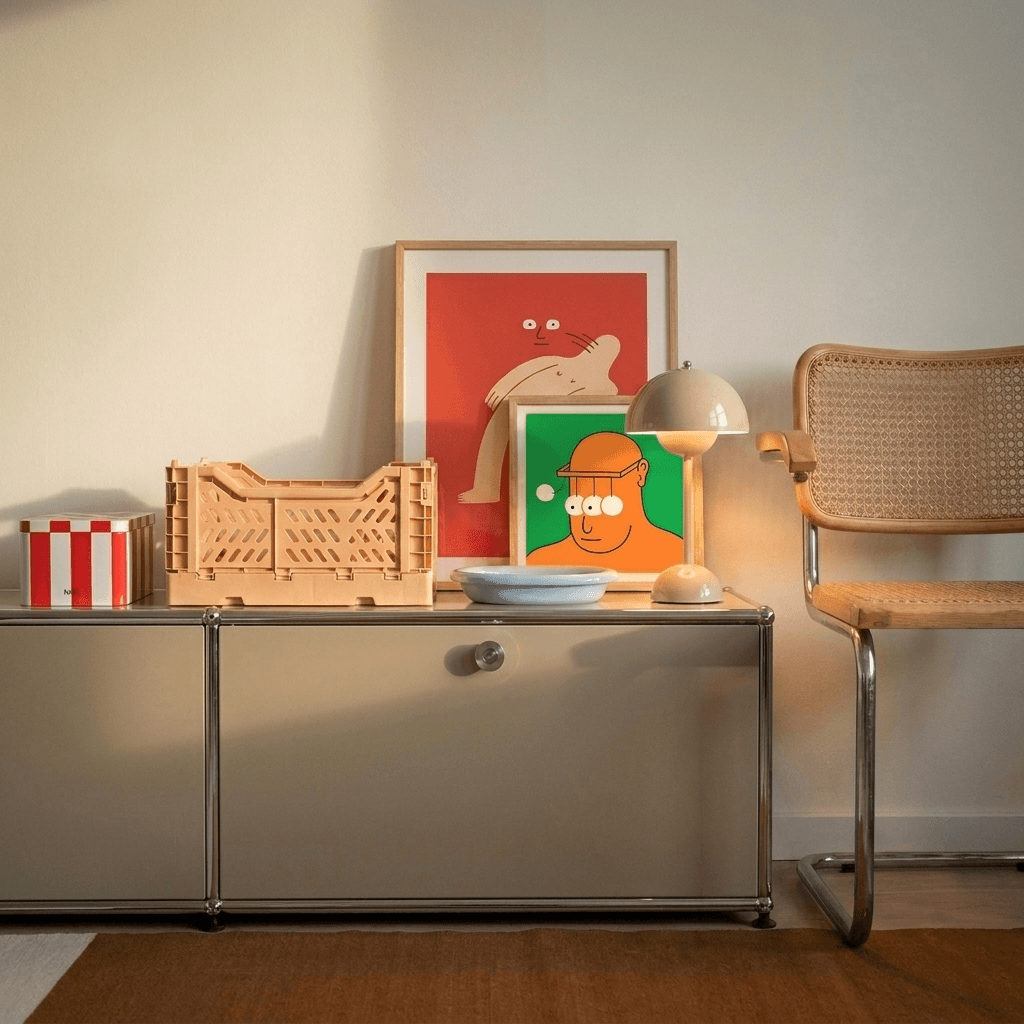
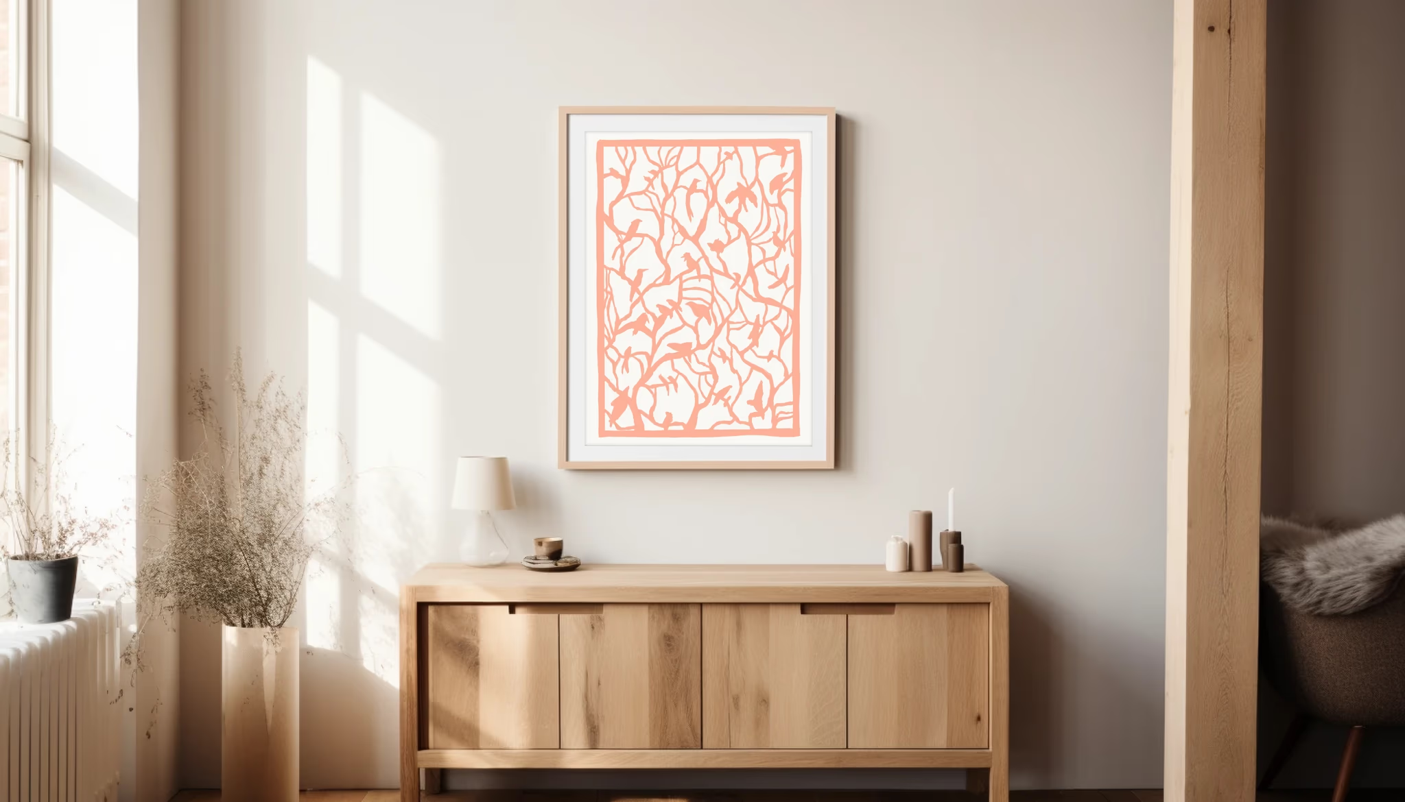
A looser range than the pinboards suggest. The safe advice is minimal line art in neutral tones, and it's safe precisely because it disappears. The interiors the style is actually built on have always carried real pictures with real subjects. Three directions work reliably. Flat-colour abstraction, shapes doing the talking, sits naturally against clean-lined furniture: browse the abstract prints to see the register. Line illustration brings wit into rooms that risk solemnity, which is most white rooms: that's the illustrations category. And the still life, food on a table, flowers in a glass, is the most Scandinavian move of all, because the style has always taken domestic life seriously: those live in botanical and still life.
How big should it be?
Bigger than your first instinct. The most common mistake in pale rooms is a small print marooned on a large wall, which reads as an apology. The old rule of thumb holds: art hung above furniture wants to be roughly two-thirds the width of what's beneath it, either as one piece or as a group hung tight enough to read as one. Above a standard sofa that means one 50 x 70 print is a minimum, a pair is better, and a trio earns the wall. On its own wall, a single 50 x 70 in a frame holds a surprising amount of space, because the frame and the margin do half the work.
What are the best framed print combinations?
Combinations beat singles in this style, and the recipe is simple: the frames agree, the prints converse. A pair works when one is quiet and one is loud, the calm piece giving the bold one permission. A trio works when something repeats across all three, a palette, an artist's hand, a subject. Hanging Sia Siamos's table still lifes as a set is the obvious worked example: same hand, same warmth, three different meals. Whatever you combine, match the frames; in a Scandinavian room the frames are architecture, not decoration.
Will colour break the look?
No, and believing it will is how rooms end up beige. The white walls aren't the point of the style, they're the backdrop for the things that are. A saturated print in a white room isn't a risk, it's the reward: the room was calm so that something could speak. If everything on the wall whispers, the wall is just texture.
When you've chosen, the practical half is already written up: the living room styling guide covers placement, and the print size guide covers the measuring. Or start from the art itself and let the room follow: the whole collection is on the Scandinavian wall art page.