The Scandinavian gallery wall: spacing, rules and restraint
Spacing, alignment, frames and restraint: how to hang a gallery wall that reads as Scandinavian, and why what you leave off matters most.
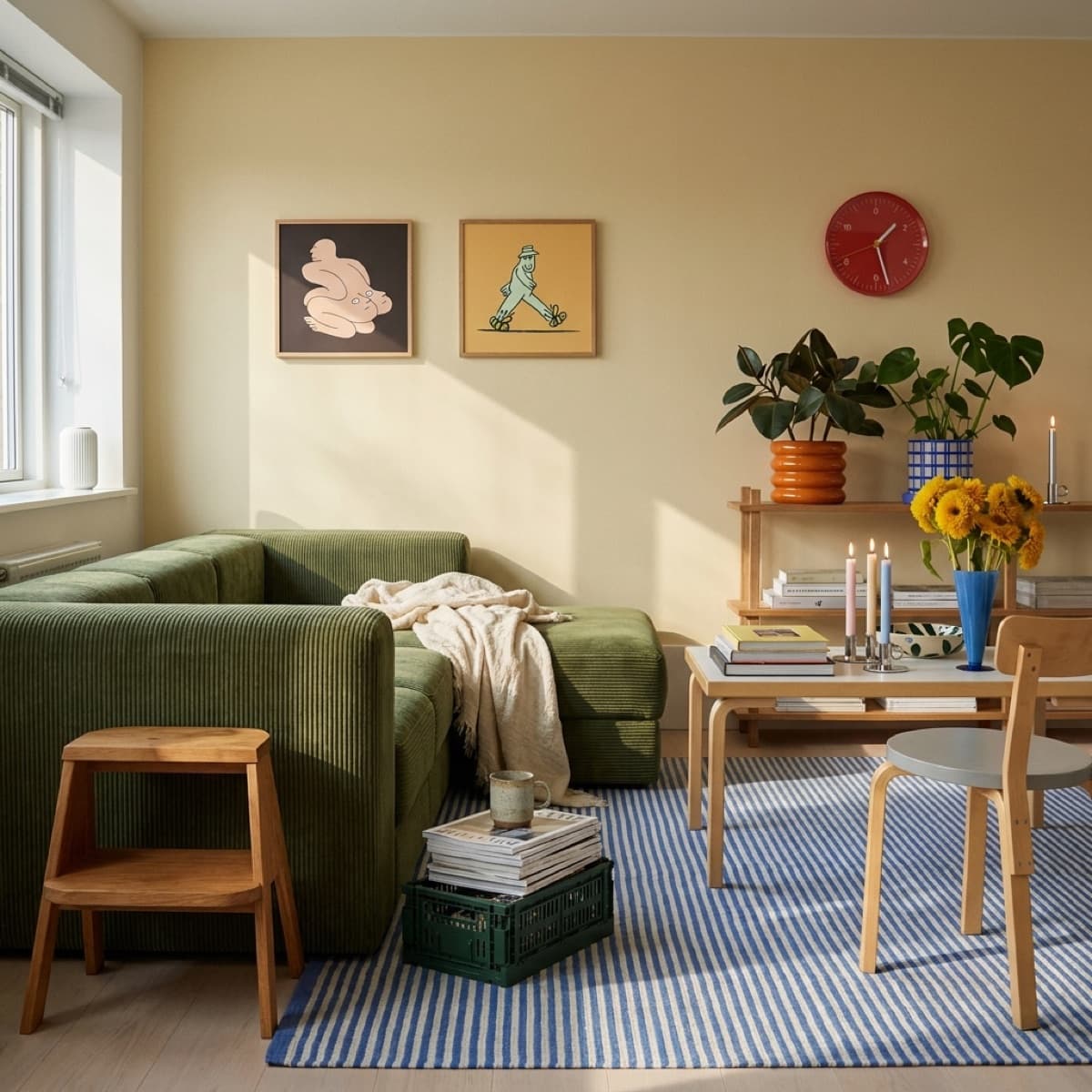
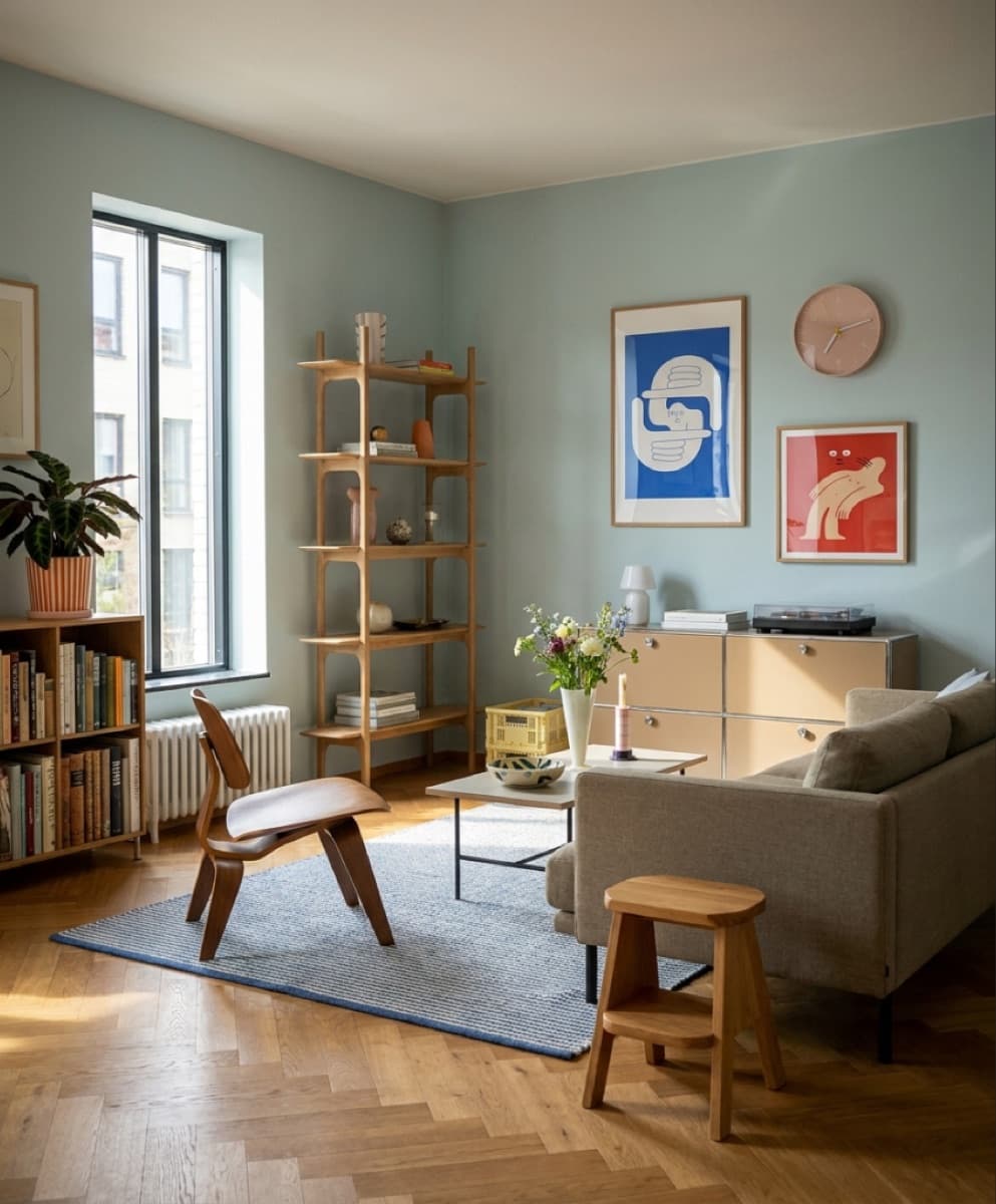
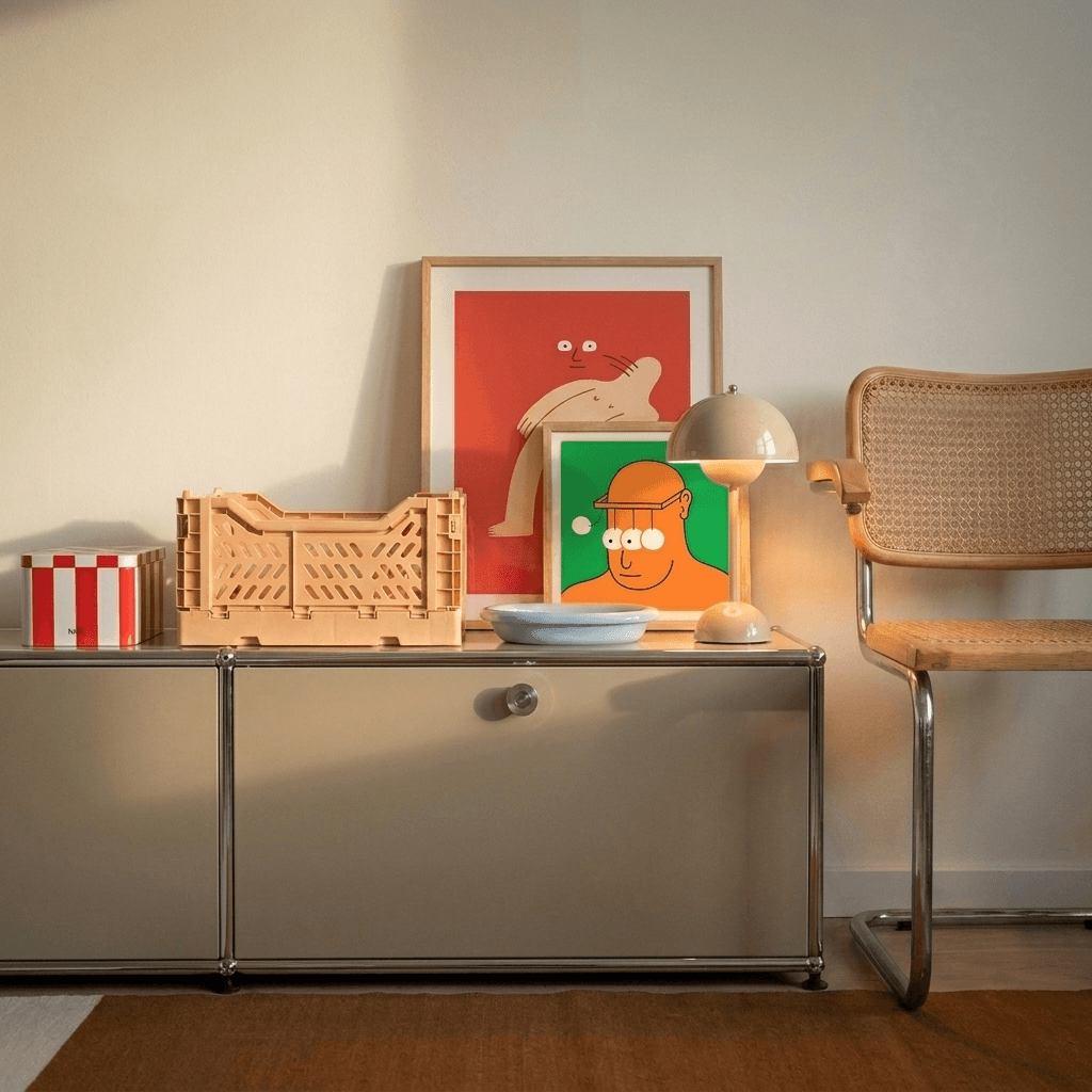
You can tell a Scandinavian gallery wall by what isn't on it. No frames touching, no shelf of clutter underneath, no eleventh piece squeezed in because the gap looked lonely. The style's whole trick is treating the wall as part of the arrangement rather than the thing to be covered.
How far apart should the pictures be?
It's the question everyone asks, and the answer is a convention rather than a law: keep the gap consistent, and keep it small, roughly a hand's width between frames. Consistency matters far more than the number. A wall where every gap matches reads as one deliberate piece; a wall where the gaps drift reads as things that happened to be hung near each other.
Height follows the same logic. Galleries hang pictures so their centres sit near eye level, and a gallery wall borrows the habit: treat the whole cluster as one big picture and put the centre of the cluster at eye height, not the centre of each frame.
The rules that earn their keep
Three are worth obeying. Pick an anchor first: the largest or strongest print, placed just off the centre of the arrangement, with everything else built out from it. Align to a line: a shared bottom edge, a shared centre line, or a clean grid, but pick one and hold it. And make the frames agree: either every frame matches, or the frames vary and the palette of the prints holds the group together. One of those two has to be constant or the wall falls apart.
Lay it out on the floor before anything goes near a hook. Paper templates on the wall, if you want to be certain, cost ten minutes and save ten holes.
Two formats are plenty
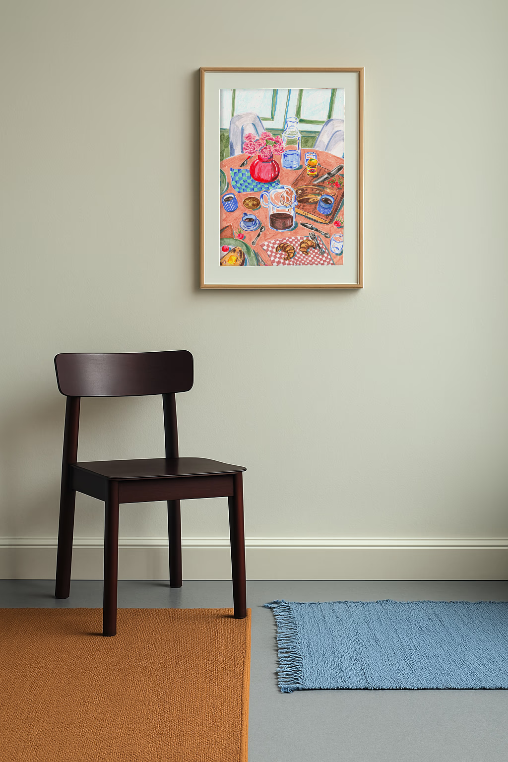
Every print in our gallery hangs in one of two shapes: a 50 x 70 cm portrait or a 50 x 50 cm square. That's a constraint we chose, and it's a gift for gallery walls, because two repeating formats organise themselves almost without help. A row of squares with one portrait as the anchor; portraits in a line with a square tucked at the end; a two-by-two of squares beside a single tall piece. Matching frames across both shapes, and the wall reads as designed rather than collected.
What to leave out
Start with three pieces. Three is already a gallery wall, and a Scandinavian one at that: the style trusts a wall with room left in it. You can add later, one piece at a time, and the arrangement will tell you when it's done, which is usually two prints before you think it is. If a piece needs the wall to be busier to work, it's the wrong piece.
For the mechanics of building bigger arrangements, we've a full guide to creating an art wall; for the room around it, start with eight ways to dress a wall. And if you're deciding between the two formats, the print size guide settles it wall by wall.