Choosing wall art by colour for a Scandinavian-style room
Half Man is a pink figure on a bright green ground. Eye Nose Eye sets a cream head on a near-black ground, with circles of yellow, red and blue. Both would sit happily in the same white room, which says something useful. The number of colours in a print matters less than which colour family it belongs to.
So that's how this guide works. Pick the family first, then the print.
What colours go with Scandinavian decor?
Take the usual starting point: pale walls, pale wood, wool and linen. That base is quiet on purpose, and it'll take almost anything. The trick is deciding what you want the wall to do. A blue print cools the room, a warm one softens it, green brings in the outdoors, and black and white sharpens it.
One rule of thumb works across all four. Find a colour already in the room, on a cushion, a lamp or a rug, and look for it in the print. You don't need to match everything. One echo is enough to make a print look chosen rather than dropped in. (For more on how much colour a room can take, see our guide to choosing a Nordic art print.)
Blue wall art
Blue is the easiest place to start in a pale room, and the catalogue offers it in two different strengths.
- Turquoise: Surfer with Orange Sun balances a surfer above a turquoise wave, with a bright orange sun behind her. It's the brighter of the two.
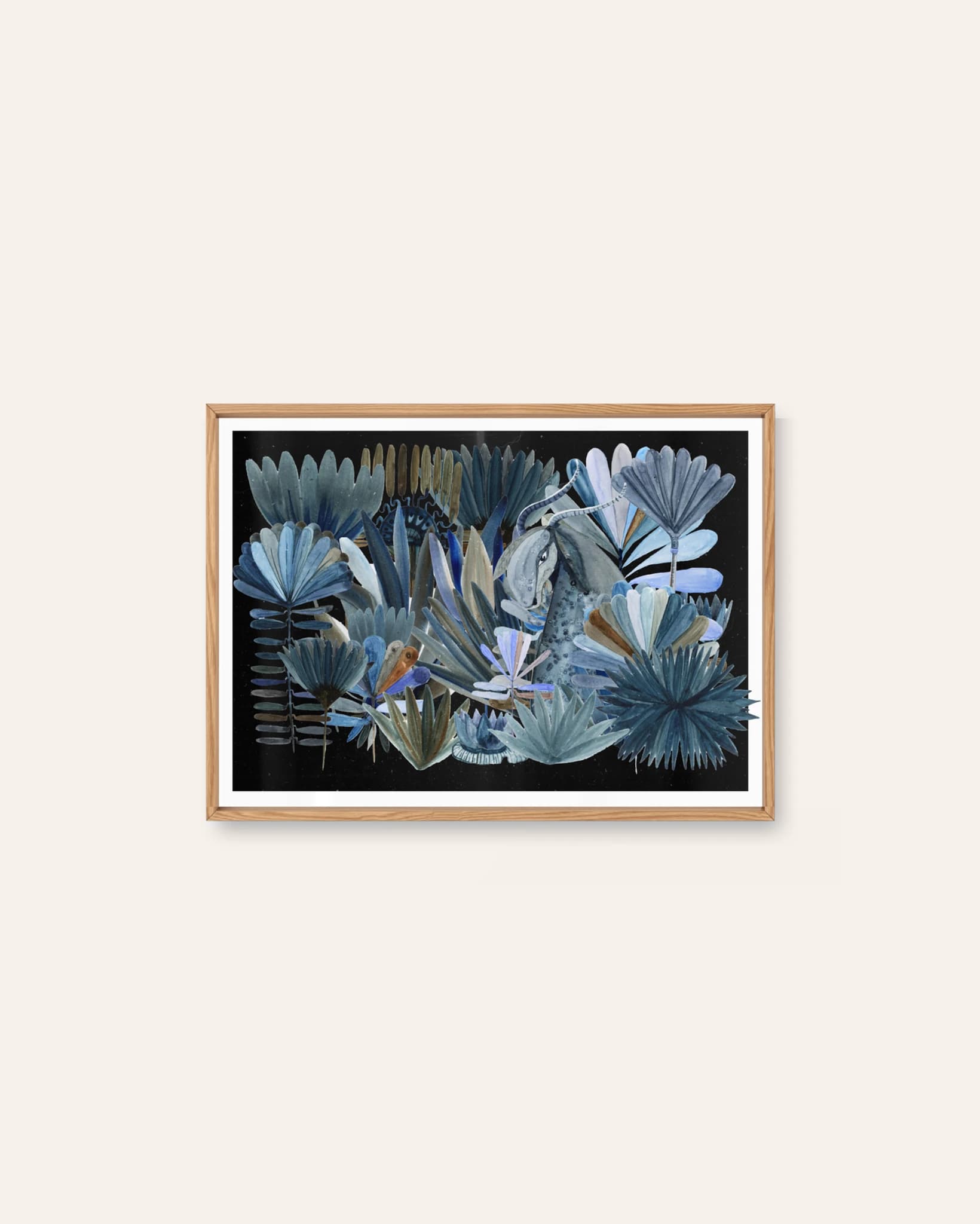
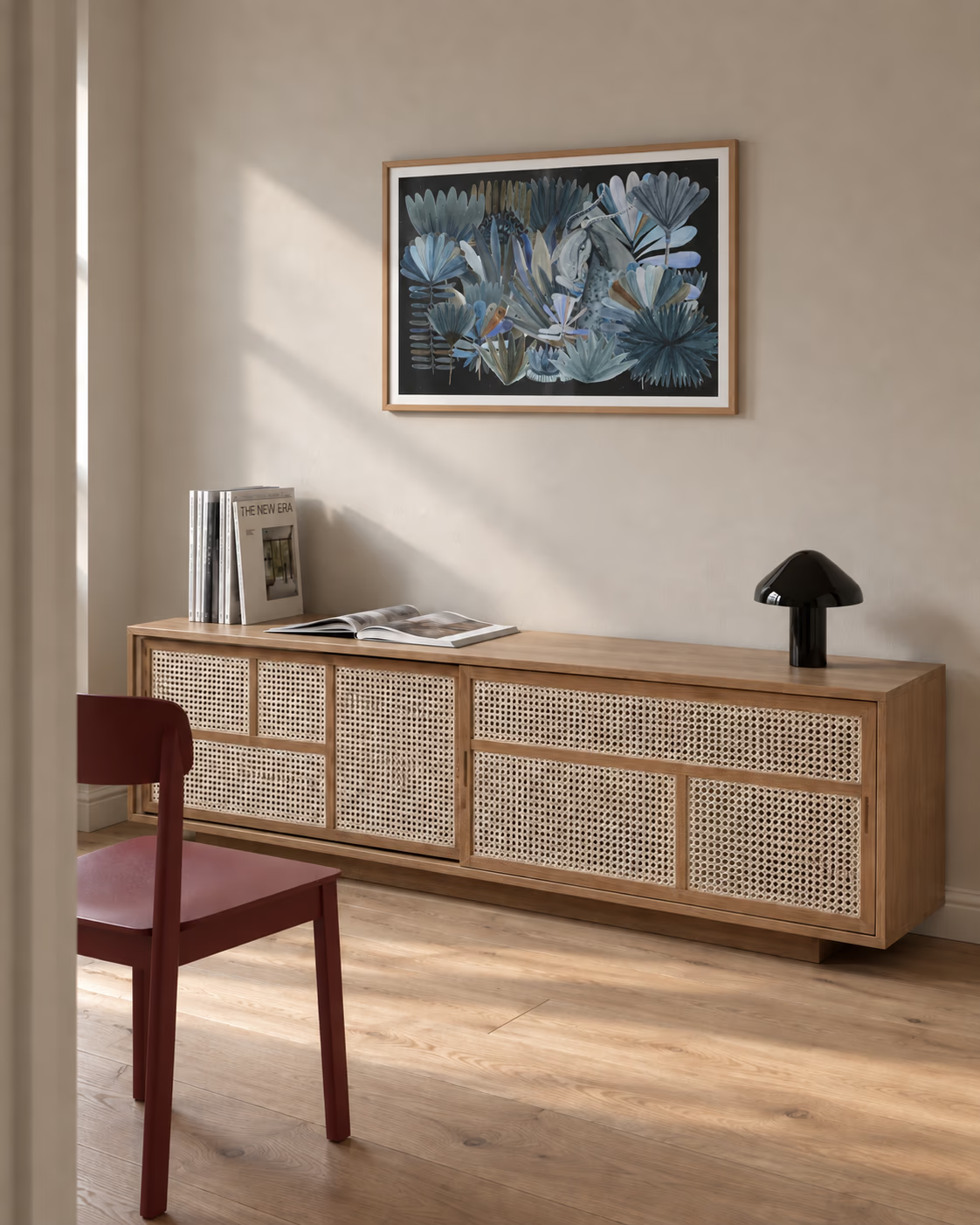
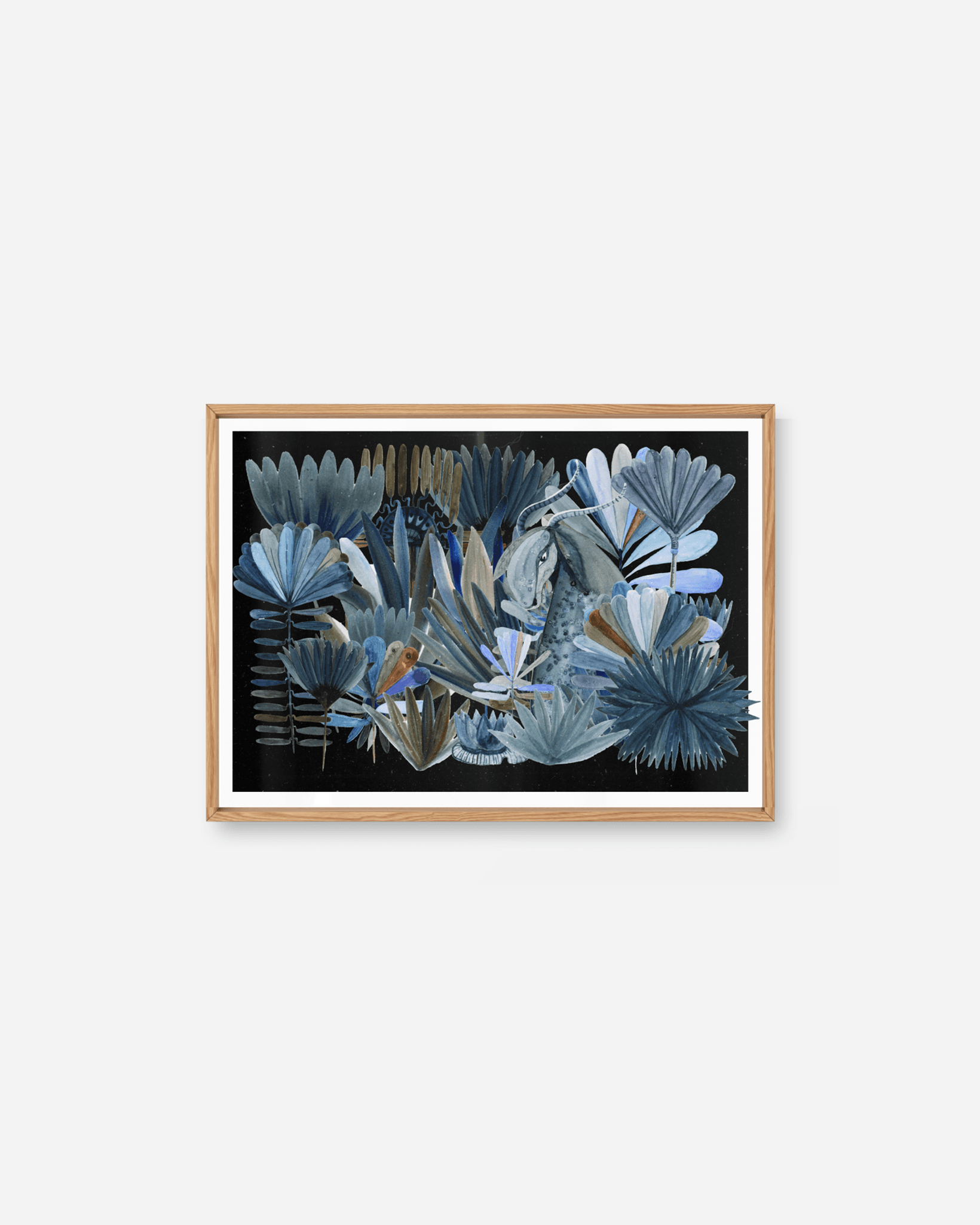
- Dark and cool: Creature Among Blue Leaves layers broad blue fans and pointed fronds over a dark background, with small touches of ochre breaking up the cool palette.
The two winter photographs by Markus Naarttijärvi, Pines Under Starlight and Frozen currents, are blue too, but a different kind: deep, night-time blue, nearer to black than to sky. They suit a room where blue is the main colour rather than an accent.
Warm tones: peach, ochre and orange
Warm prints soften a cool white room, either in one tone or in a mix.
- Morgenstrekk is ochre on warm peach, and the description calls it the gentlest and most optimistic of Simen Wahlqvist's prints.
- Morgenlevering is more crowded: a warm terracotta table with coffee, croissants and pink carnations in a red vase.
- Desert Circles pairs rust-coloured rocks and dusty pink hills with bright turquoise openings.
For something warmer still, Markus Naarttijärvi's Sun Over the Forest is a huge, hazy sun over a dark line of trees, with the sky burning orange around it. The warmth is concentrated in one place, so the rest of the picture stays dark.
Green wall art
Green comes in two moods here.
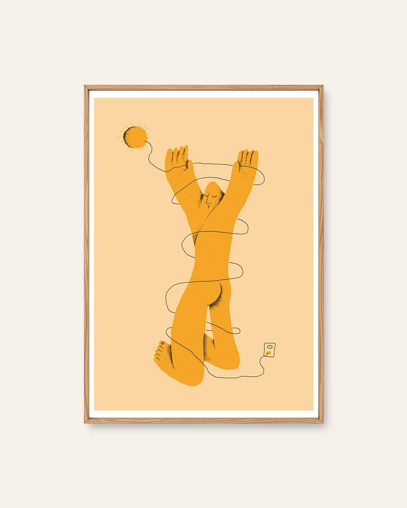
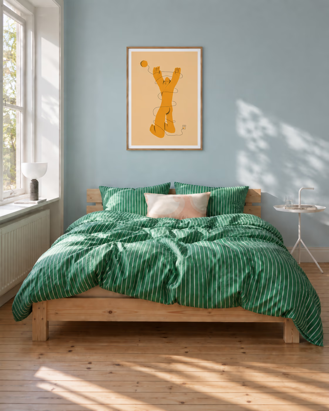
The graphic one is bright and flat. Half Man sets a pink figure on a bright green ground, and Mean Snothing puts an orange man on a flat green one. Both are Simen Wahlqvist's work, and both bring one big block of colour into a pale room. Use one, not both, unless you want the wall to be the room's main event.
The quiet one is dark forest green, and it comes from photography. In Path Through the Trees, a wooden boardwalk winds through dense, shadowed forest towards a bright clearing, and Sheep on the Track has a green pasture opening beyond a muddy track. Both are damp and shadowy rather than fresh and bright, which makes them sit well against wood.
Black, white and monochrome
This family is smaller than you'd think, and it's worth being clear about what's in it.
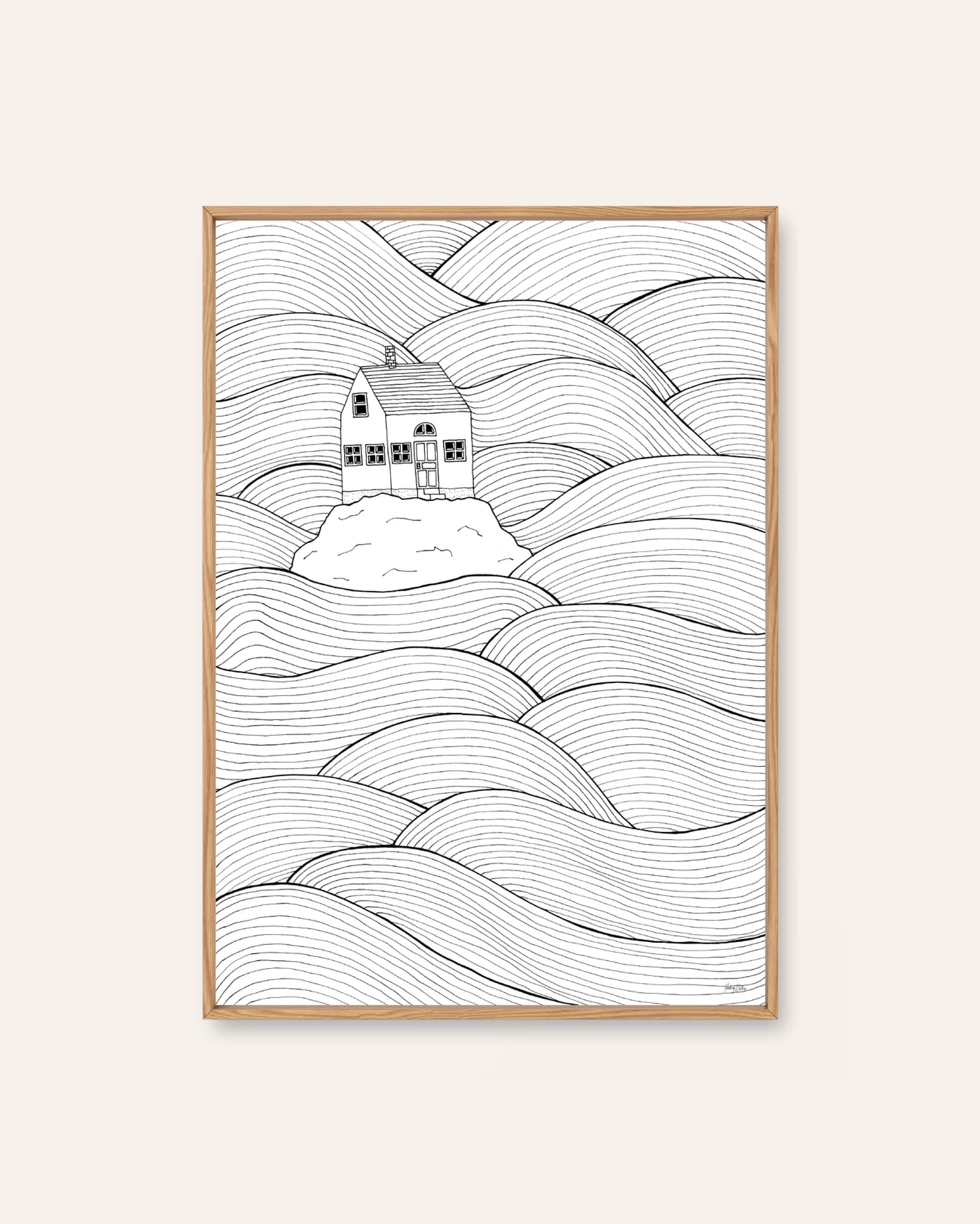
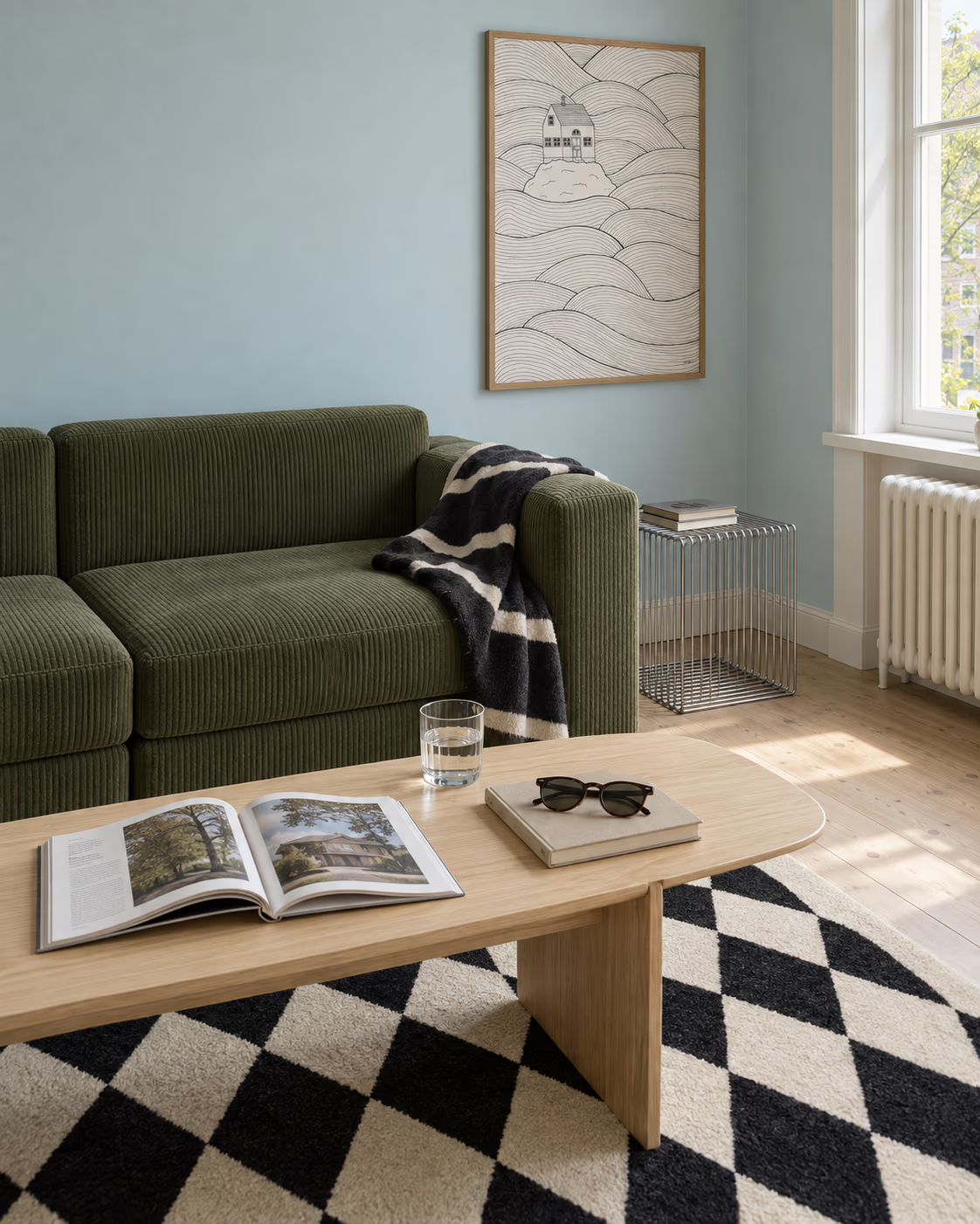
Small House Big Ocean is the one true monochrome: a little house on a rock in a sea of waves, drawn entirely in black ink line. The description says it hangs well beside anything with colour, which makes it the useful partner for a colourful print. Eye Nose Eye sets a cream head on a near-black ground, with a splash of yellow, red and blue in the middle.
On the photography side, none of Markus Naarttijärvi's ten prints is black and white. The nearest are the winter night pictures, which are so close to a single blue and black that they read as nearly monochrome. If a true black and white photograph is what you want, we don't have one yet.
How do you build a neutral palette with one thing that isn't?
If you want a calm wall, keep it to a single colour print and a single quiet partner.
- Pick the one print that carries the colour: a blue, a warm piece or a green.
- Add a monochrome partner, such as Small House Big Ocean, or leave a good gap of plain wall.
- Keep the frames matching, whichever you choose. Each print page offers no frame, or wood, black or white, priced by size.
Prints built on one main colour do some of this work for you. Morgenstrekk is ochre on warm peach, so it reads as calm even on a pale wall.
When you've picked a family, the illustrations, abstract and photography pages are the quickest way to see more, or start from the Scandinavian wall art page and let the colour lead.