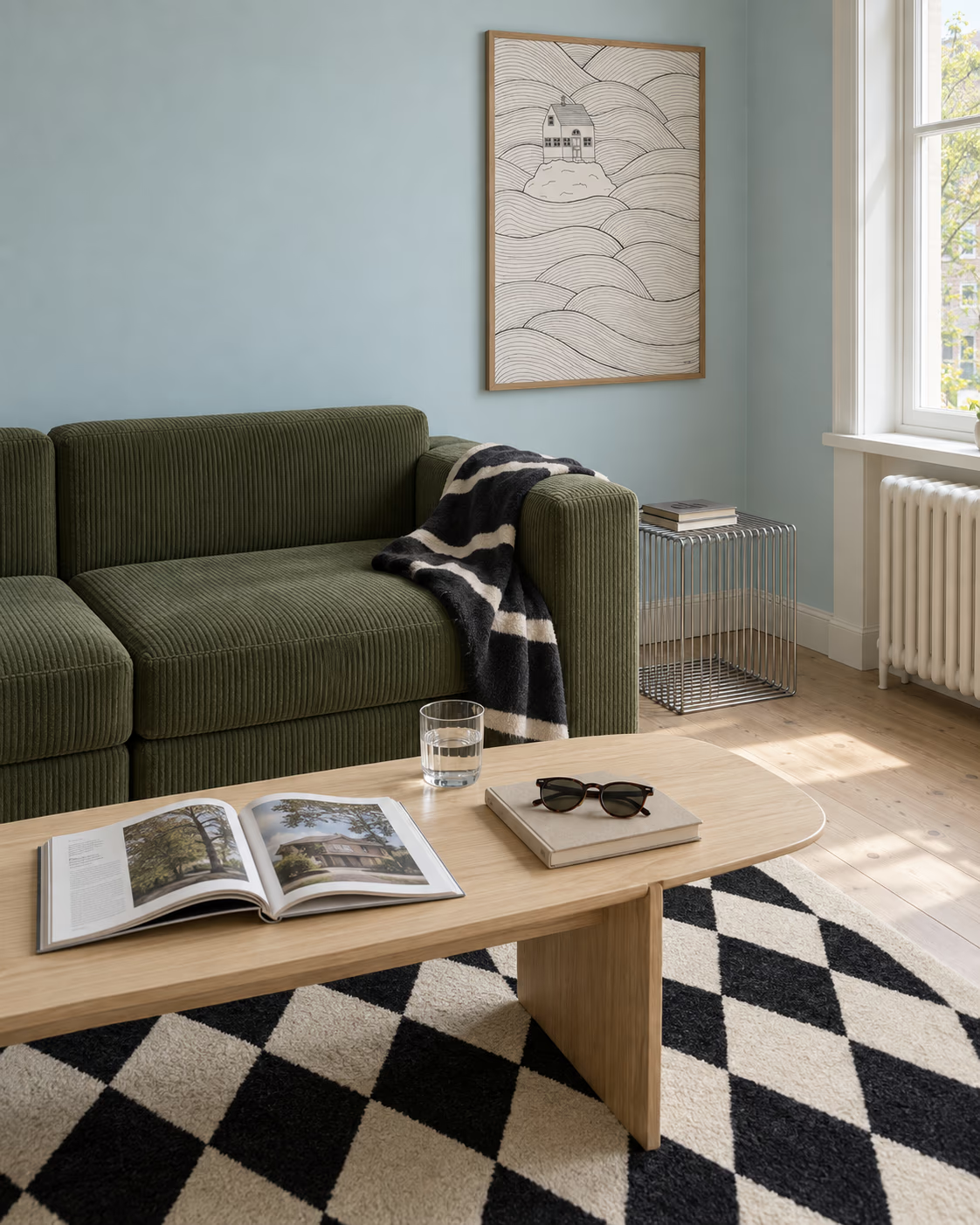
Wall art for the bedroom: what to hang above a bed
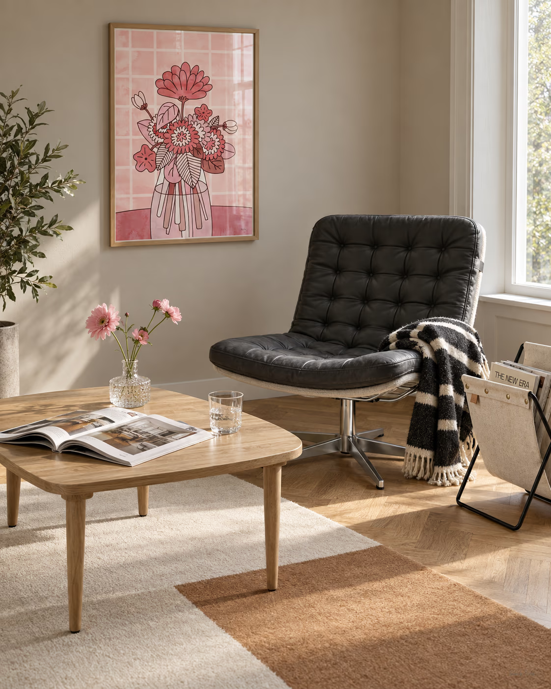
The bedroom is the only room you look at while lying down, and almost nobody styles it that way. The art goes above the headboard, where the only people who ever see it are guests passing the open door.
That is not a reason to leave the headboard wall bare. It is a reason to think about two walls instead of one.
Two walls, two jobs
The wall above the bed is the one that frames the room from the doorway. It wants presence: one substantial piece, or a considered pair, centred on the bed.
The wall opposite the bed is the one you actually look at, twice a day, at your least critical and most receptive. It can afford to be gentler and more personal. A single quiet print here does more for how the room feels than anything above your head ever will.
Height and width above the headboard
Two numbers save most of the guesswork.
- Leave roughly 20 to 25 cm between the top of the headboard and the bottom of the frame. Any higher and the art floats off on its own; any lower and it looks like it slipped.
- Aim for the art to span about two thirds of the bed's width. Above a double, a single portrait print can look stranded. A pair, or one large piece, holds the wall.
Centre the arrangement on the bed, not on the wall. Beds are rarely dead centre once you have allowed for a door or a radiator, and the eye reads the bed as the middle of the room regardless.
Quiet, not bland
Bedrooms reward restraint, which is not the same as beige. The prints that work here tend to carry one clear idea in a soft palette.
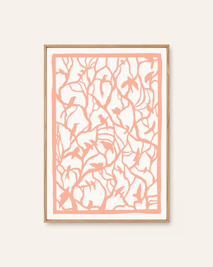
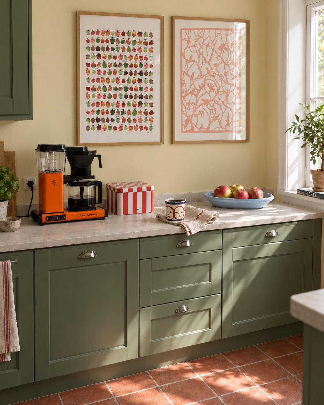
- Tree Top Peach is the gentlest thing in the gallery, a papercut lattice of branches and birds in a single warm tone. It settles a room without disappearing into it.
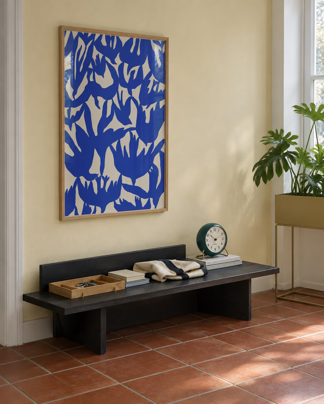
- Swallow Dive is all movement, but in two colours only, cobalt on cream. Calm from the bed, confident from the door.
- Tree Top Peach weaves perched birds into a soft peach lattice, gentle enough for a nursery and detailed enough not to be twee.
- Morgenstrekk is a figure taking the day's first stretch, ochre on peach. It is a good-natured thing to wake up facing.
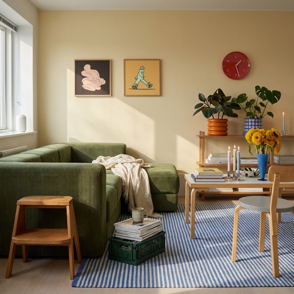
One steer from experience: be careful with faces. The deadpan illustrations are excellent company in a home office and slightly odd company at 3am, when something with eyes is looking back at you across the duvet.
Pairs beat singles here
Bedrooms are symmetrical rooms. Two bedside tables, two lamps, two of you. Art tends to follow, and a pair of prints above the headboard reads as deliberate in a way a lone print often does not.
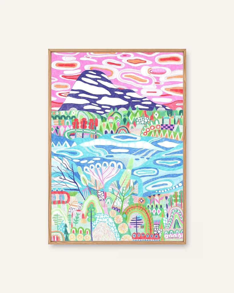
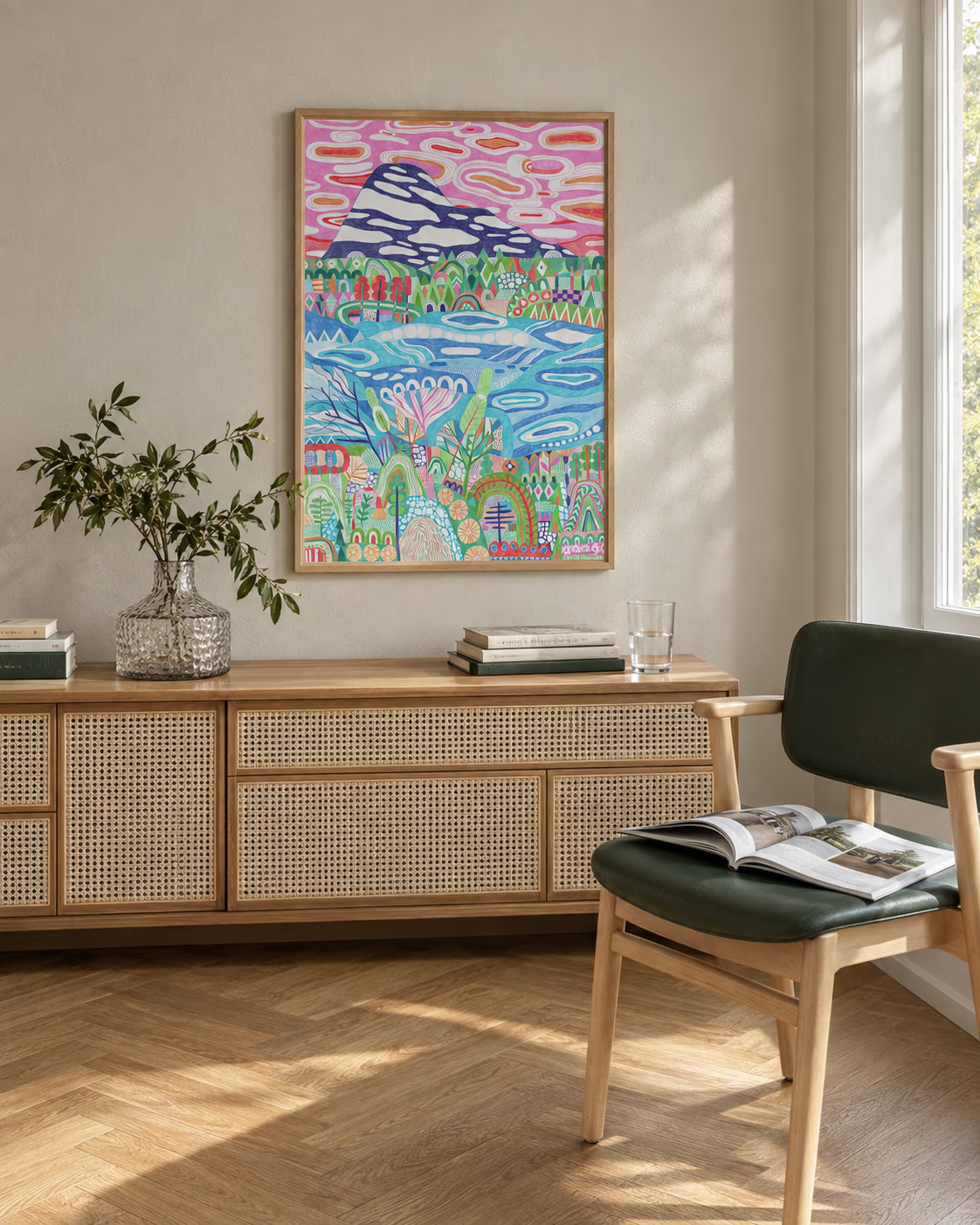
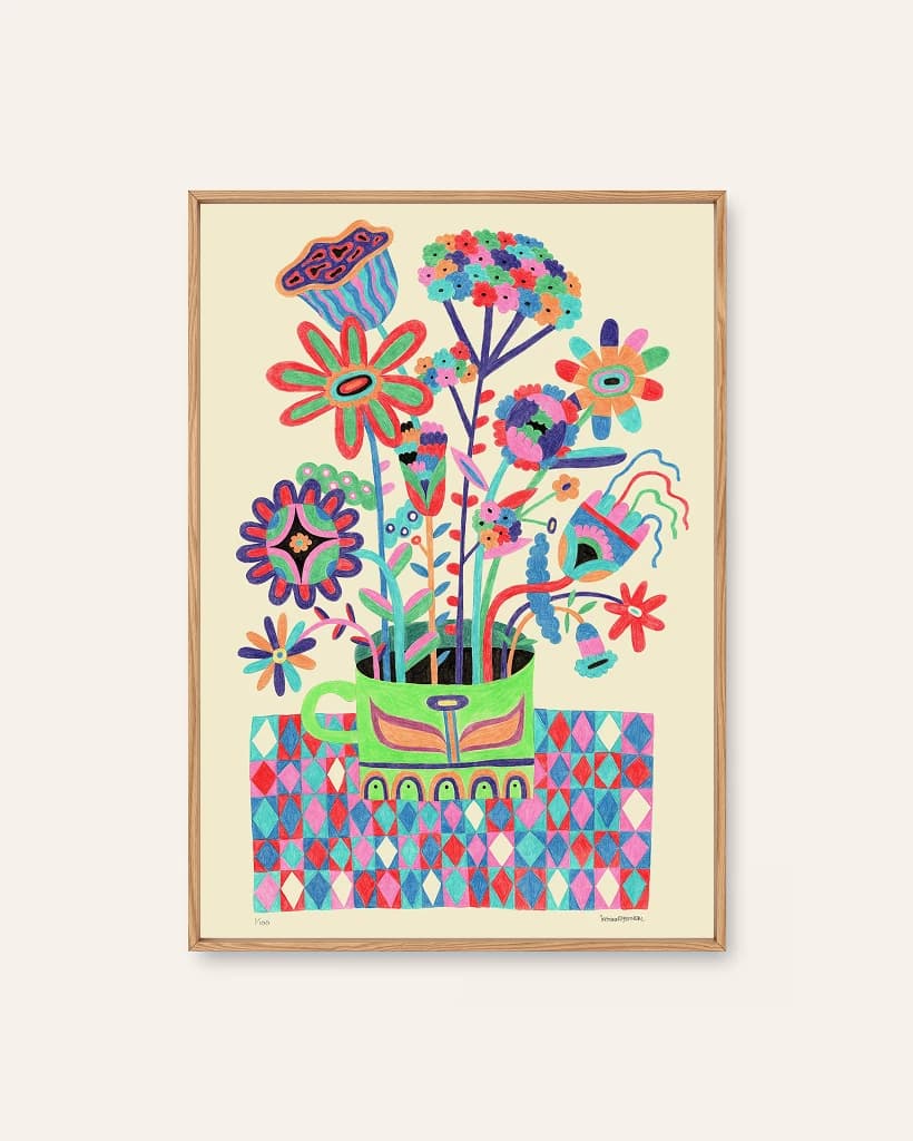
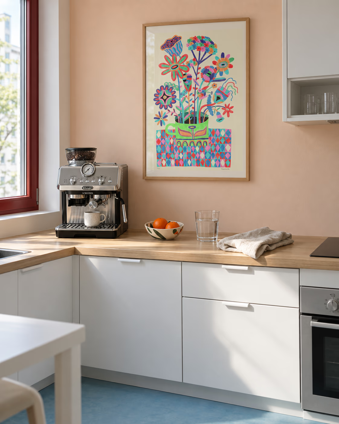
The easiest pair is two prints from the same hand. Hang Eltsjoen and Trysilkaffe side by side and you get variation and repetition at once, the same coloured-pencil density across a lake and a bouquet, which is the whole trick of a small series. Keep the gap tight, 5 to 8 cm, so they read as one object.
If you would rather build something looser across the wall, the guide to making an art wall covers spacing and anchors in more detail.
Small bedrooms
When there is no wall to spare, stop hanging and start leaning. A print propped on a chest of drawers or a low shelf, overlapping a lamp or a stack of books, gives the room art without another set of holes in the plaster. It also lets you swap it in ten seconds, which is the real luxury.
One practical note for above a bed: choose acrylic glazing over glass, and fix it properly into the wall rather than the plasterboard alone. It is the one wall where the consequences of a bad fixing land directly on your head.
If you want to see the calmer end of things in one place, the bedroom collection gathers the prints chosen with exactly this room in mind.