Kitchen and dining room wall art: two rooms, two problems
Kitchens are hostile to art. Steam, cooking grease, heat off the hob, and about forty centimetres of free wall between the units and the extractor. Dining rooms are the exact opposite: the one room where people sit still for two hours with nothing to look at but the walls.
Same meal, two completely different styling problems. Worth treating them separately.
The kitchen: work around the units
You are not looking for a feature wall in here. You are looking for the leftover pieces of wall that nobody has hung a rail on yet.
- The end of a run of units, where the worktop stops and there is a slice of wall before the door.
- Above a doorway or a hatch, which is dead space in almost every kitchen.
- The wall the kitchen table sits against, if you have one.
- The worktop itself, with a small print leaning against the splashback behind the kettle.
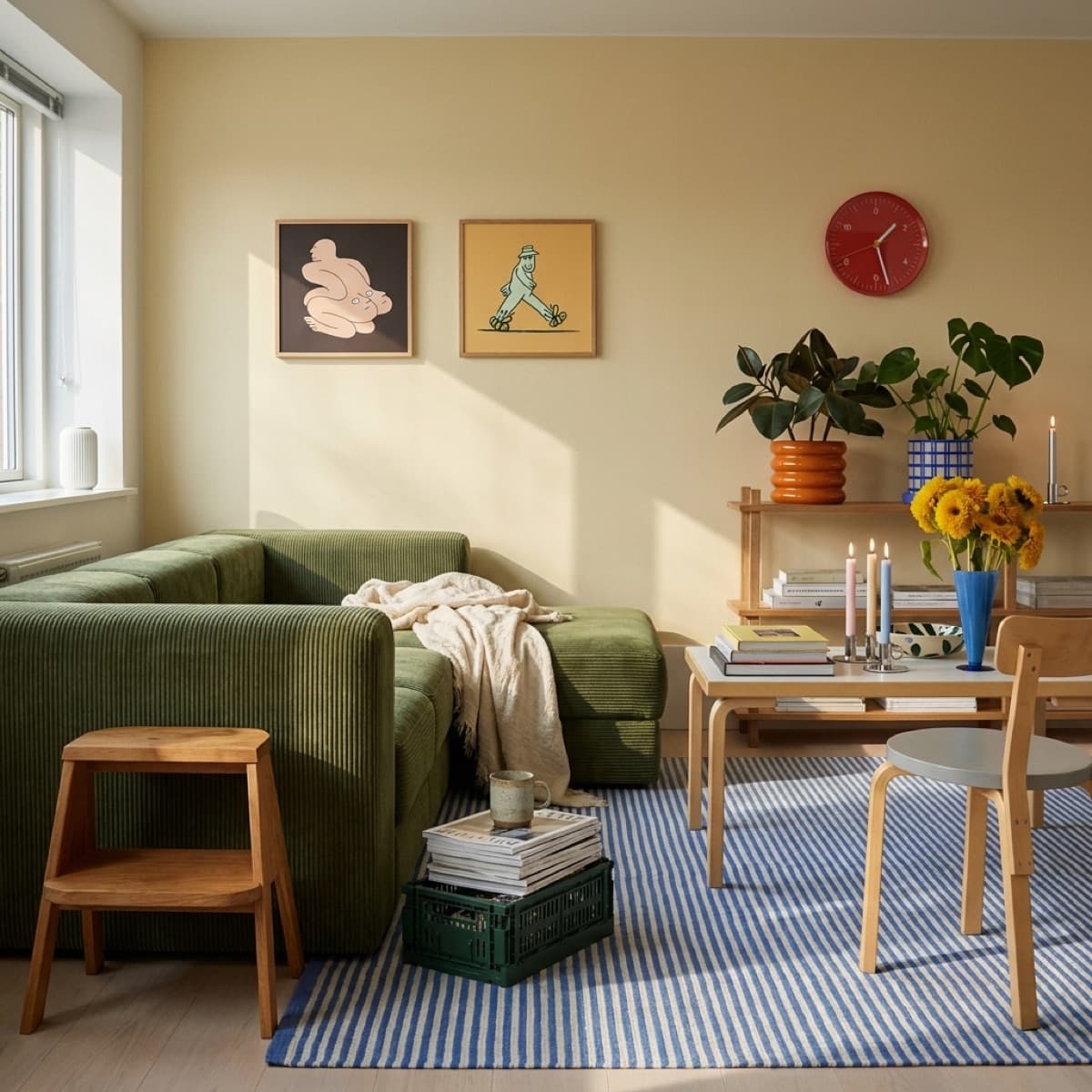
Small and square tends to fit these gaps better than a tall portrait print. Simen Wahlqvist's 50 x 50 cm illustrations were not designed for kitchens, but they slot into awkward spans neatly, and a deadpan drawing is good company while you wait for the pasta.
Two practical rules. Never hang anything directly above the hob, because the film of cooking grease is real and it does not come off a mount. And in a kitchen, framing behind glazing is not optional, it is the only thing standing between your print and the steam.
The dining room: hang it lower than you think
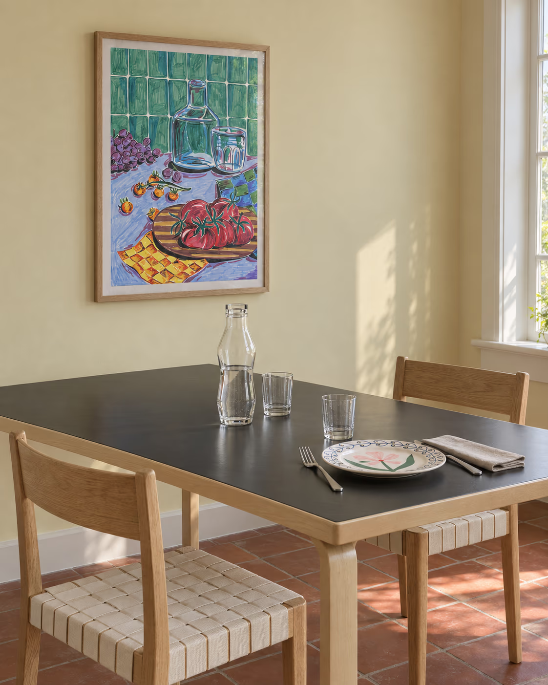
The standard advice is to centre art at about 145 to 150 cm, which is average standing eye level. In a dining room everybody is sitting down. Drop the centre of the piece by 10 to 15 cm and the art meets the room where it actually lives.
The other dining-room quirk is light. A low pendant over the table throws most of its light downwards, which leaves the walls dim and the art in shadow after dark. Either hang where a wall light or the pendant's spill reaches, or accept that the piece is a daytime pleasure and choose something with enough contrast to hold up in low light.
Food on the wall is not a cliché if it is good
There is a reason still life has survived five hundred years. Painted well, a table full of food is a painting about company, not about lunch.
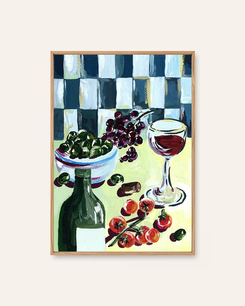
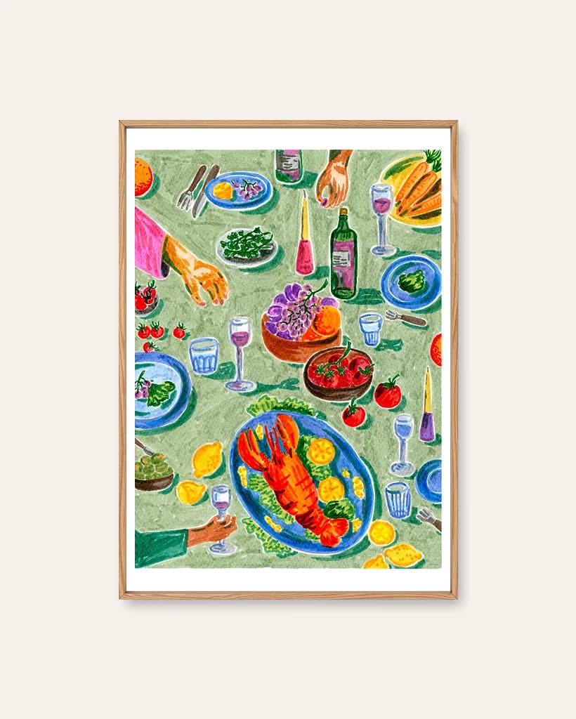
Sia Siamos paints exactly that, and all four of her prints are versions of the same generous idea.
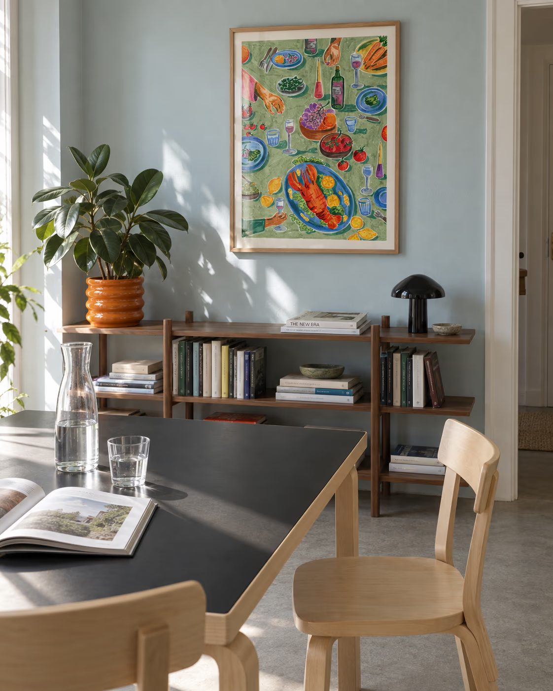
- Hummer og Vin looks straight down on a lobster dinner mid-toast, hands reaching in from the edges of the cloth.
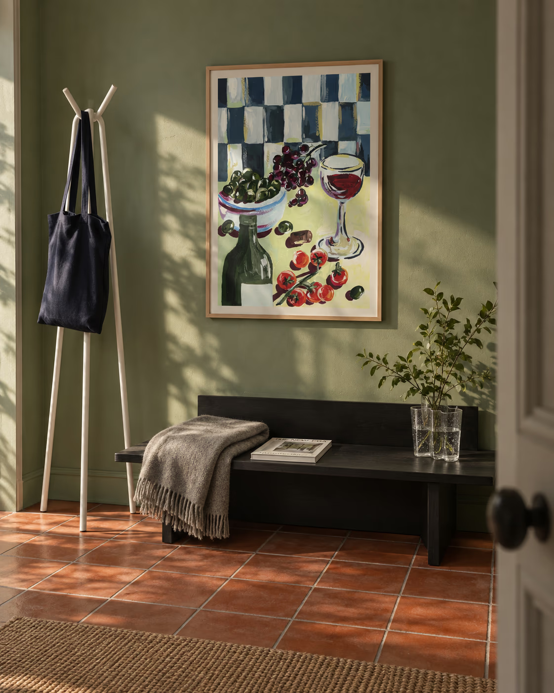
- Vinkveld is a wine evening in thick, glossy strokes, the cork already adrift. The moodiest of the four, and the one for a dining wall.
- Morgenlevering is a breakfast table in full swing, cafetière and croissants and carnations in a red vase.
- Hyttefrokost piles tomatoes and grapes against green tiles with proper holiday ease.
They were painted as kin, so they pair beautifully. Breakfast on one wall and wine on the other marks out the two ends of a day, and it gives an open-plan kitchen and dining space a bit of narrative rather than two unrelated pictures.
If you would rather not hang your dinner
Not everyone wants food art in the room where they eat. Fair enough.
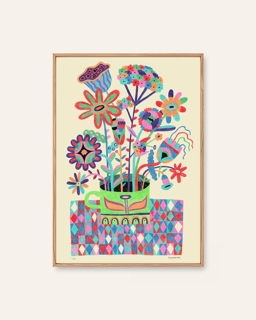
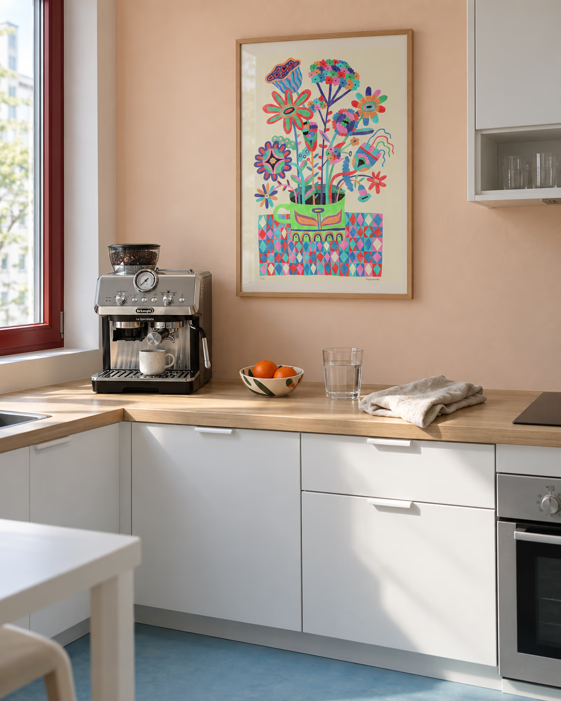
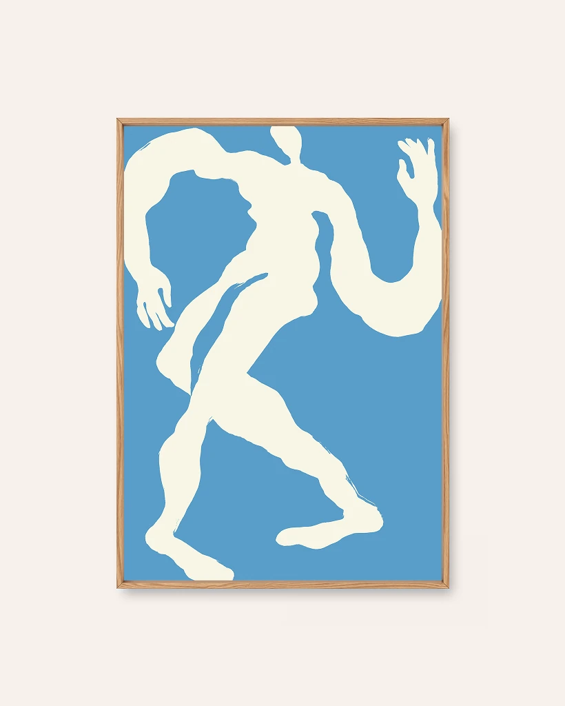
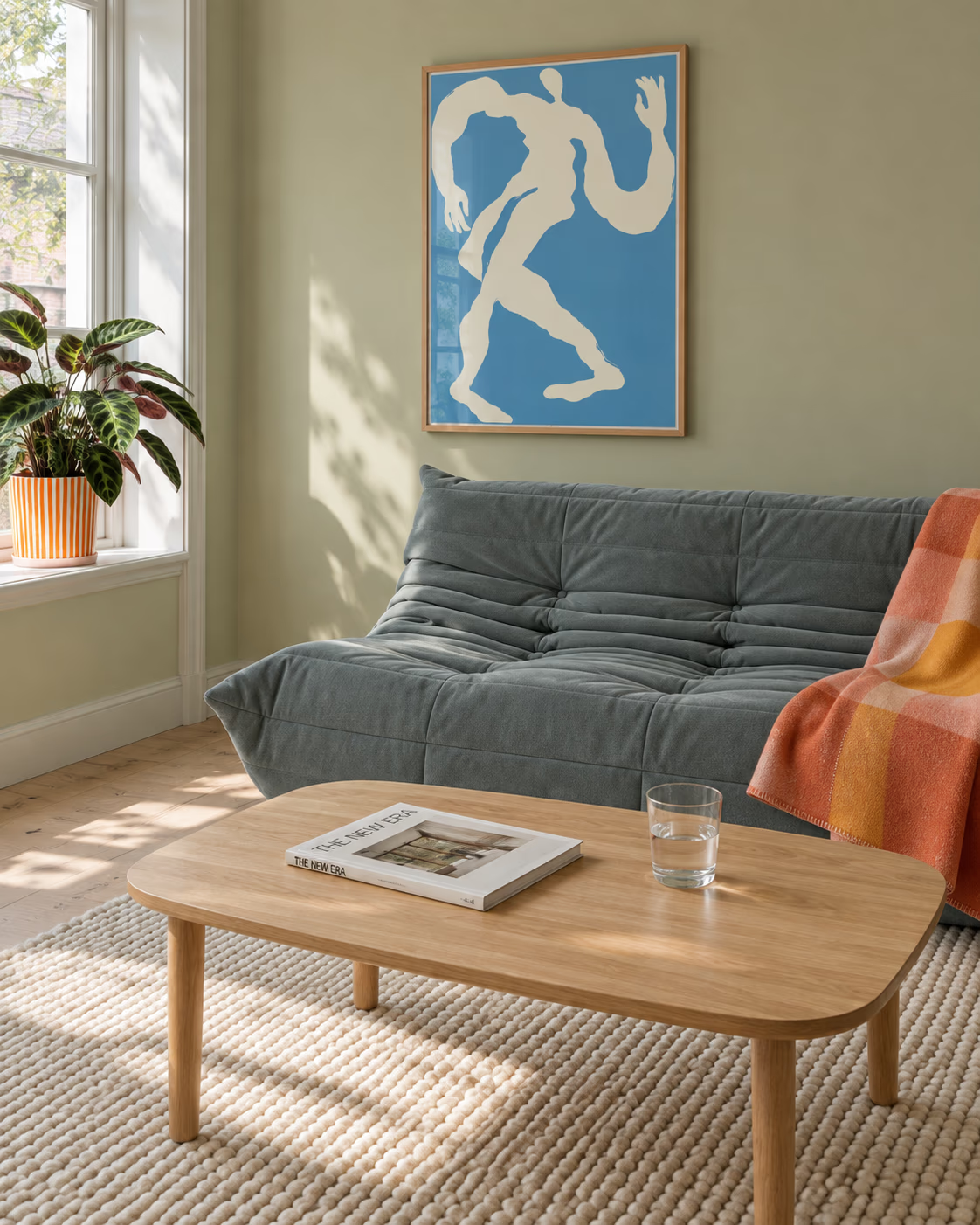
Trysilkaffe brings folk pattern instead, an impossible bouquet crammed into a green mug, drawn petal by petal in coloured pencil. Dancer does the other job: cream on sky blue, fresh enough to lift a kitchen that has gone slightly too tasteful. Both bring colour without adding another plate to the table.
Have a browse of the botanical prints if the food-and-flowers end of the gallery is where your kitchen wants to go.