Scandinavian design style wall art: five tests for choosing a print
Alvar Aalto designed Stool 60 in 1933, and Artek says it has been in continuous production ever since. It has a seat and three legs, all in solid birch. That's the whole object. It's also stackable, and Artek describes it as equally suitable as a seat, a table, storage or a display surface.
It's a good place to start with design-style wall art, because the stool does what the best Scandinavian design does: it decides what the object is for, strips out everything else, and lets the material show. Wall art can work the same way. Here are five tests, borrowed from the stool, for picking a print that earns its place.
Does one idea carry the picture?
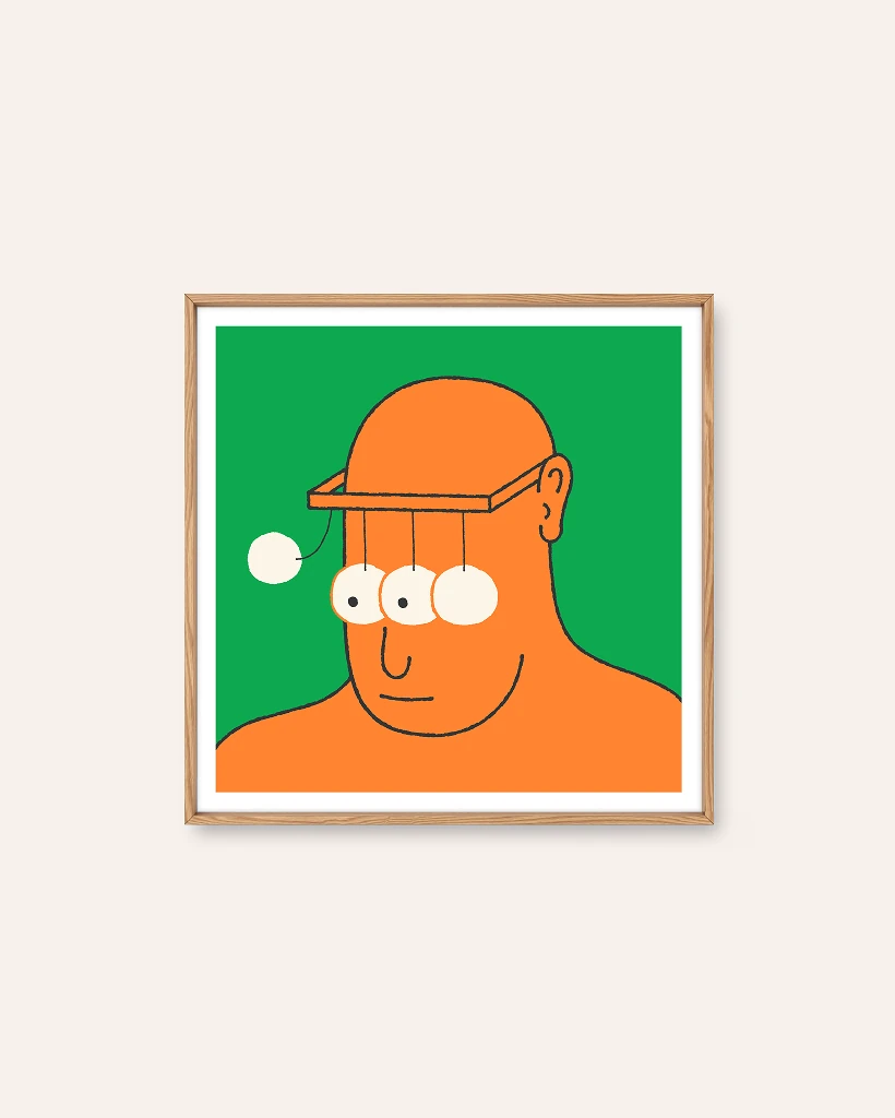
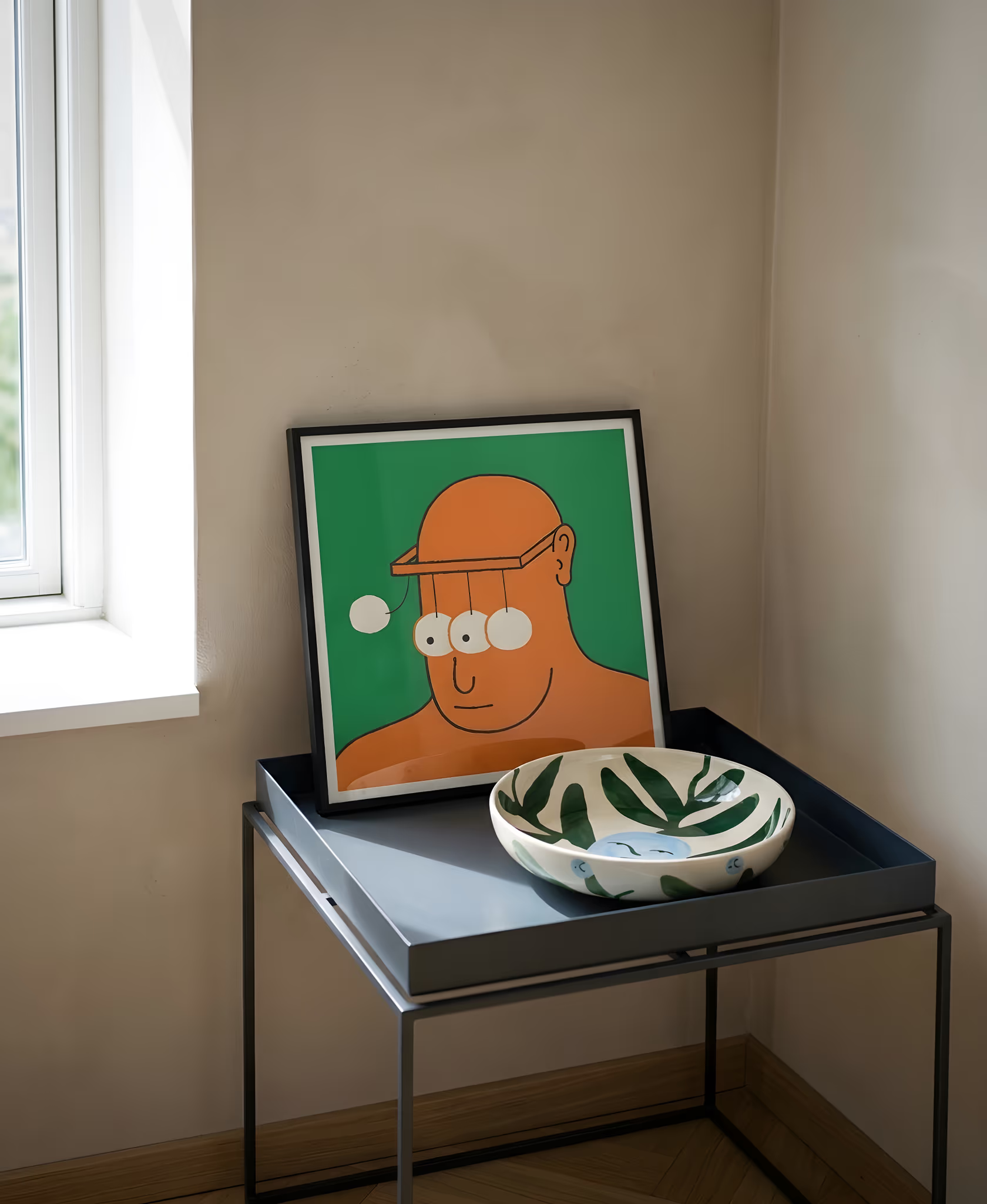
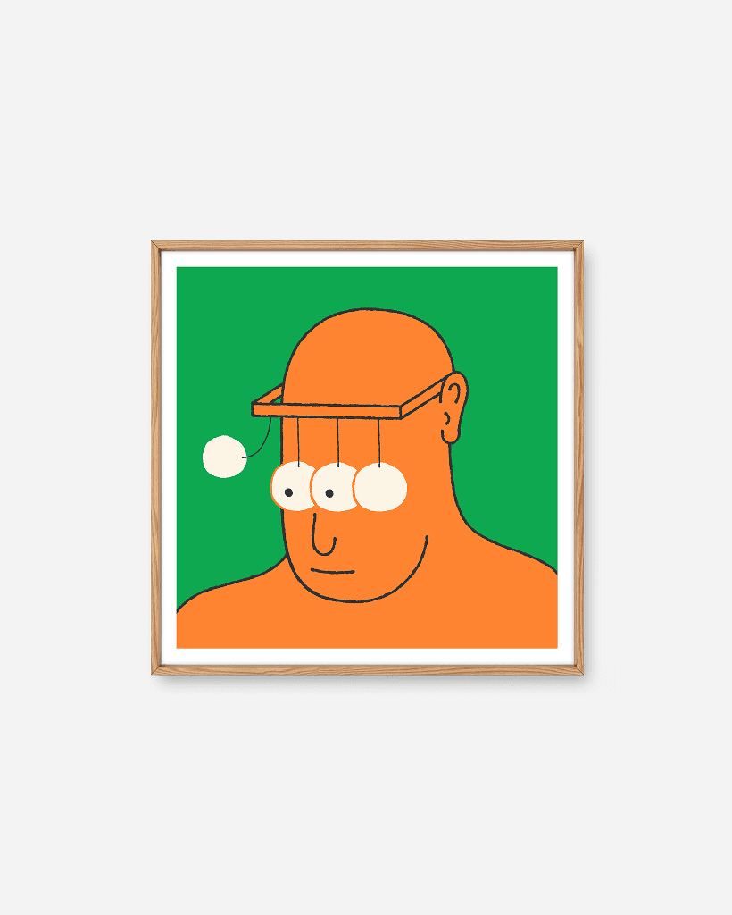
Stool 60 has one idea, a seat held up by three legs. Look for the same in a print. Simen Wahlqvist's Mean Snothing gives an orange man a Newton's cradle for eyes on a flat green ground, and the joke is the entire picture.
A busy print isn't a failure, but a design-led room tends to want the opposite: one thing, clearly. If you can describe the picture in a sentence, it's probably passing this test.
Can you see how it was made?
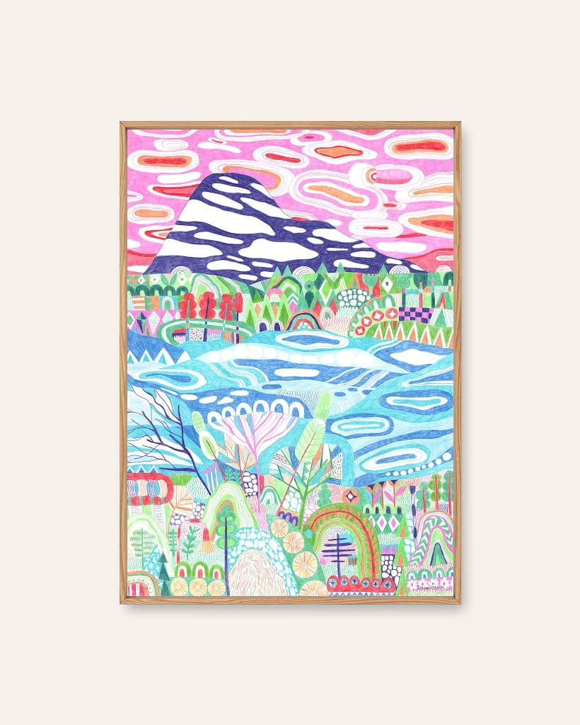
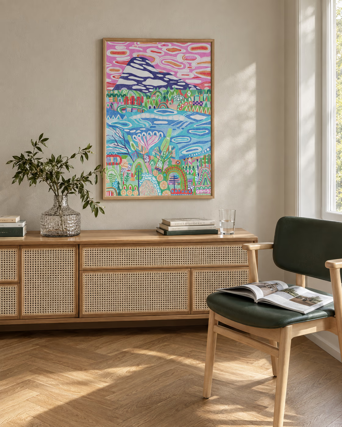
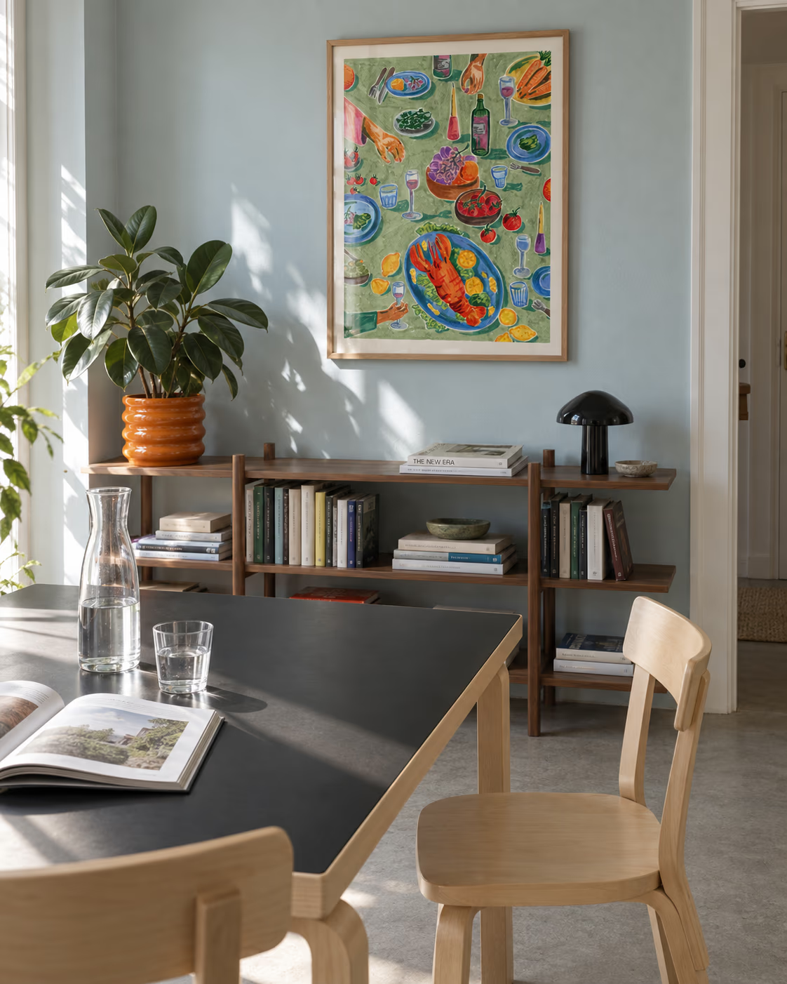
Aalto's stool shows its birch. Nothing is painted over to look like something else. In a print, the equivalent is a visible hand. Ingunn Dybendal's Eltsjoen is drawn stroke by stroke in coloured pencil, and you can see it. Hedvig Wallin's Sunday Brunch is ink and watercolour, with a wonky perspective that proves a person drew it.
Paper counts too. Every print here is printed to order on 200gsm uncoated paper, which gives a matte surface rather than a glossy, plastic one. If you frame it, the framing guide covers wood, black and white, which are the three frame options on every product page.
Does it know what the room is for?
Design-led pieces are made for a use. A stool wants to be sat on, and a print wants to be looked at from somewhere. Decide where you'll be when you look at it. A hallway you pass through suits a bold shape that reads at a glance, like Simen Wahlqvist's Slingshot, white on a bright tomato red ground. A reading chair suits something with detail to find, like Mikko Saarainen's Family Trip.
The size is part of the same question. A print that's too small for its wall fails the way a stool that's too low for the table does. The print sizes guide helps you check before you order.
Is the colour doing a job?
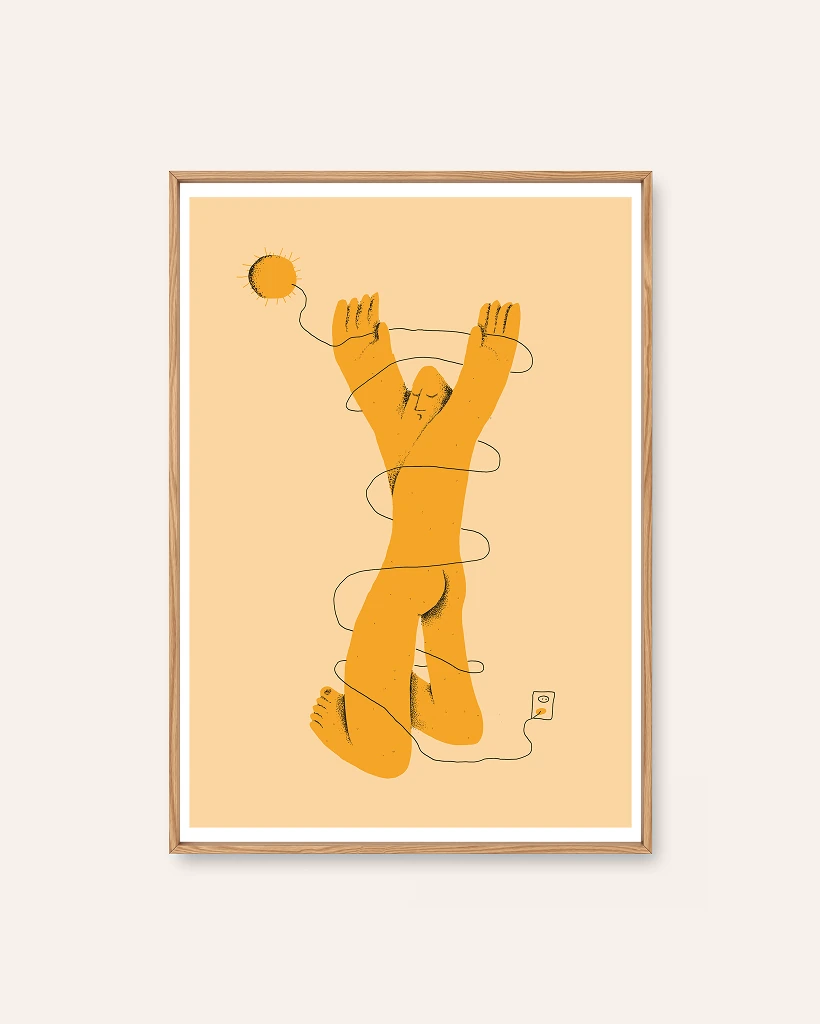
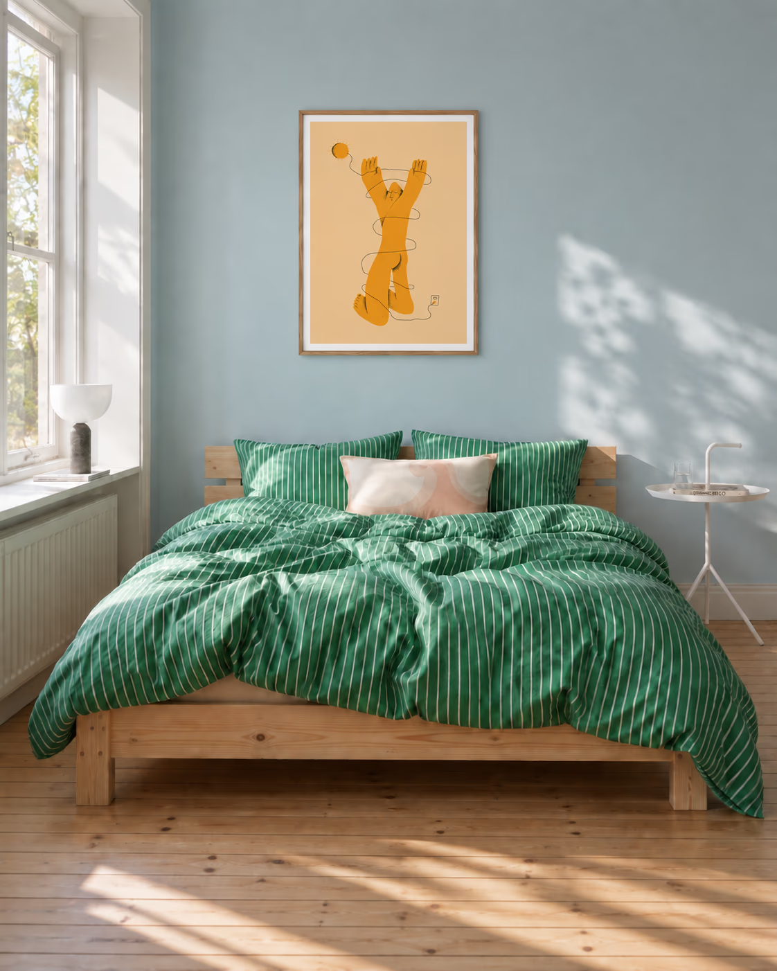
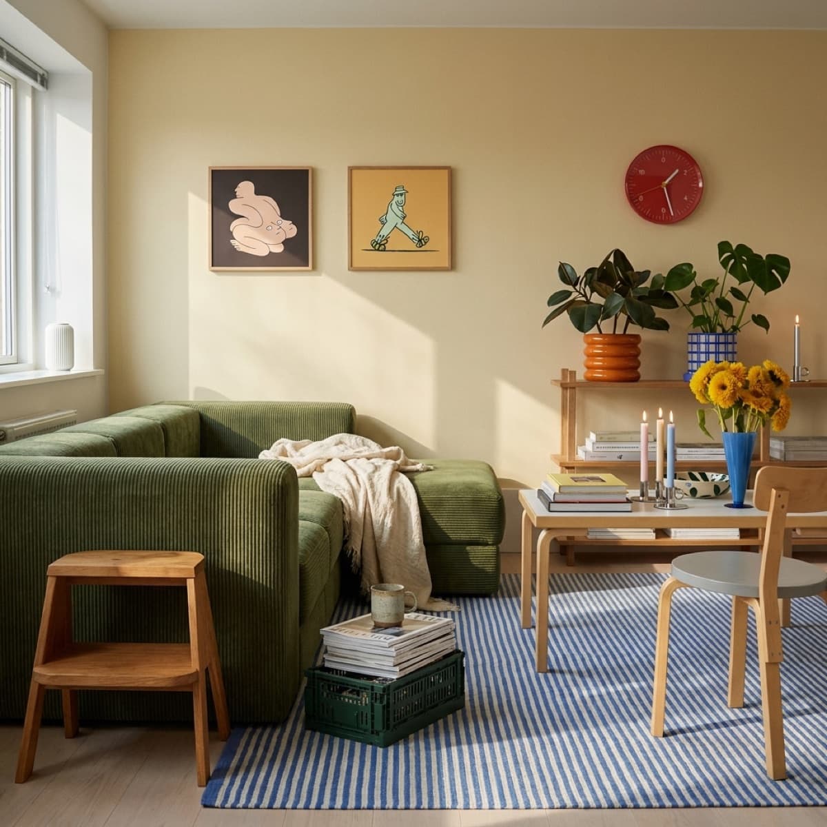
In a Scandinavian-style room, colour is usually the one deliberate exception, sitting against pale walls, wood and wool. So ask what the colour is for. It might echo something already in the room, or supply the thing that's missing. Half Man is a pink figure on a bright green ground: a lot of colour, and all of it intentional. Morgenstrekk is ochre on warm peach, and it settles a room instead of waking it.
Neither is more right. The test is whether you could say why that colour is there. If you can, it's design. If you can't, it's decoration.
Has anything been left out on purpose?
The last test is the hardest. Good Scandinavian design is as much about what's missing as what's there: no ornament that isn't pulling weight, no extra leg. Wahlqvist's work is a good example. His bio says he tries to capture moments with as few lines as possible, and his Morgenstrekk is a figure, a small sun and a charging cable. Nothing else.
It applies to the wall as well as the picture. One well-placed print, with clear wall around it, tends to look more designed than five crowded ones. The gallery wall guide is worth reading if you do want a group, because it's mostly about restraint.
Where to look
If you'd like to try the five tests on real prints, the Scandinavian wall art page has the full range, and the abstract and illustration categories are the two where the "one idea" test is easiest to run. For a wider view of what makes the style tick, how to choose wall art for a Scandinavian interior takes a different route to the same wall.